Maverick Re
Maverick Re
Reimagining real estate productivity by turning data into actionable coaching for high-performing teams.
Reimagining real estate productivity by turning data into actionable coaching for high-performing teams.
MaverickRE is Ylopo’s side project that delivers AI-powered coaching and performance tracking for real estate teams. With real-time insights, call grading, and smarter lead routing, it helps agents and leaders improve conversions while simplifying workflows.
MaverickRE is Ylopo’s side project that delivers AI-powered coaching and performance tracking for real estate teams. With real-time insights, call grading, and smarter lead routing, it helps agents and leaders improve conversions while simplifying workflows.
My Role
My Role
Senior Product Designer
Senior Product Designer
Deliverables
Deliverables
Design System
Design System
User Interview
User Interview
Research artifacts
Research artifacts
Prototypes
Prototypes
UX/UI
UX/UI
Team
Team
Lead Designer
Lead Designer
Senior Product Designer
Senior Product Designer
Middle UX/UI Designer
Middle UX/UI Designer
Business Analyst
Business Analyst
Project Manager
Project Manager
Dev Team
Dev Team
What was the problem?
What was the problem?
Ylopo is a platform that helps real estate agents publish listings and earn commission from successful deals. Agency owners using Ylopo struggled to quickly assess their team's performance and identify where money was being lost. They needed a tool that could turn complex data into a clear, visually clean, and actionable dashboard.
Ylopo is a platform that helps real estate agents publish listings and earn commission from successful deals. Agency owners using Ylopo struggled to quickly assess their team's performance and identify where money was being lost. They needed a tool that could turn complex data into a clear, visually clean, and actionable dashboard.
Design Process
Design Process
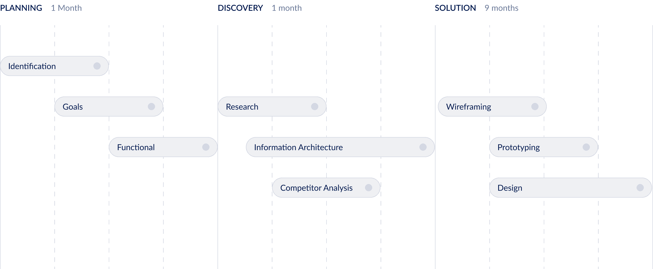
Our design process was structured but flexible — we didn’t want to just “tick the boxes,” but to make sure every step moved the project forward.
Planning: We started by identifying the problem space, aligning on goals, and defining the functional scope. This gave us a clear shared vision of what success should look like.
Discovery: Next, we turned assumptions into evidence. We ran user research, looked closely at competitors, and built the information architecture. This helped us translate scattered ideas into concrete design priorities.
Solution: Finally, we moved into creation. We sketched wireframes, tested prototypes, and refined the design through multiple iterations. The process was long (9 months), but each cycle gave us more confidence that the solution was addressing real user needs.
Instead of treating these steps as a rigid framework, we used them as guideposts. The result was a process that felt structured but also adapted to the realities of the project.
Design Process Diagram
Legacy System &
Starting Point
Legacy System & Starting Point
Ylopo had previously attempted to build a similar system, but development stalled early. A basic MVP existed, consisting mostly of tabular data. This legacy version served as a reference point, allowing us to skip wireframing and move directly into design exploration.
Ylopo had previously attempted to build a similar system, but development stalled early. A basic MVP existed, consisting mostly of tabular data. This legacy version served as a reference point, allowing us to skip wireframing and move directly into design exploration.

Outdated design of old MVP
Business Mapping & CJM
Business Mapping & CJM
Our first priority was understanding the client’s business model. We created a hybrid Customer Journey Map (CJM) and Business Map focused on the agency owner persona.
Objectives:
Visualize the owner’s decision-making process when investing in Ylopo
Identify motivations, evaluation criteria, and expectations
Highlight pain points and opportunities for improvement
This map helped align our design strategy with business goals and user needs.
User Interview
User Interview
To validate assumptions and uncover real-world challenges, we conducted interviews with directors of large real estate agencies.
Format:
~50 minutes per session
Semi-structured script
Conducted with Ylopo’s help via their network
Focus Areas:
Current methods of tracking agent performance
Most valuable metrics
Frustrations with existing tools
Expectations from a new analytics solution

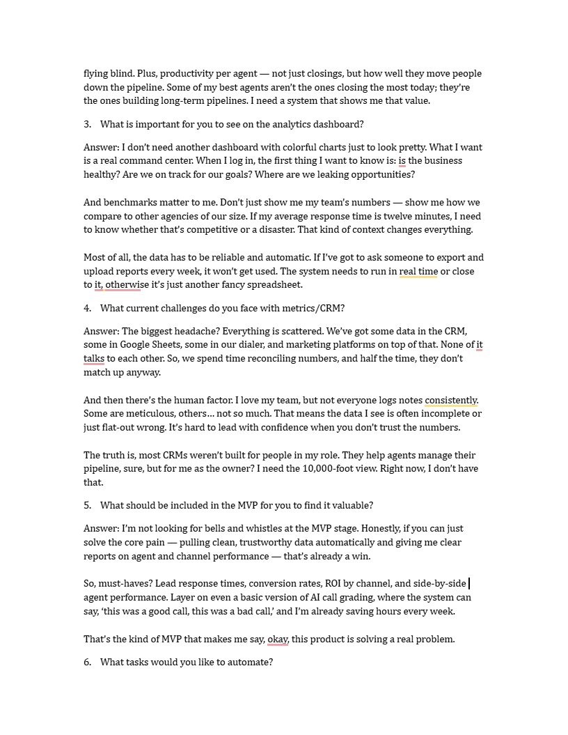
Maverick Re user interview pages
Synthesizing Insights
Synthesizing Insights
To synthesize findings and extract actionable insights, we organized the interview data into an Affinity Map in Miro.
Process:
~20 observations and quotes extracted from transcripts
Grouped into four clusters: Pains, Goals, Metrics, Feature Ideas
Patterns consolidated into higher-level insights
Outcomes:
Clear visibility into recurring problems and expectations
4 key insights defined to shape the product direction and priorities
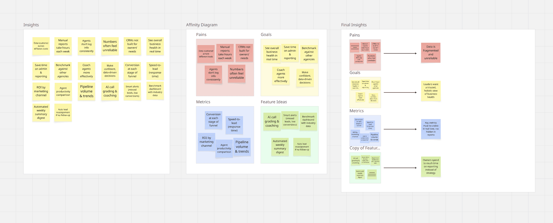
Processed Key Insights in Miro
Final Insights
Final Insights
What we learned
Data fragmentation undermines trust
Performance data is scattered across multiple tools (CRM, spreadsheets, dialers), leading to duplicated effort and conflicting numbers. Leaders cannot rely on the data to make confident decisions.Revenue is not enough
Top-line numbers (closed deals, revenue) often create a distorted view of business health, masking underperforming agents or misrepresenting team effort.Real-time visibility is critical
Agency leaders want live access to core performance metrics — speed-to-lead, conversions, ROI by channel — without waiting for manual reports.Manual reporting drains resources
Significant time is wasted every week on compiling and reconciling reports, reducing the capacity to focus on strategy and coaching.
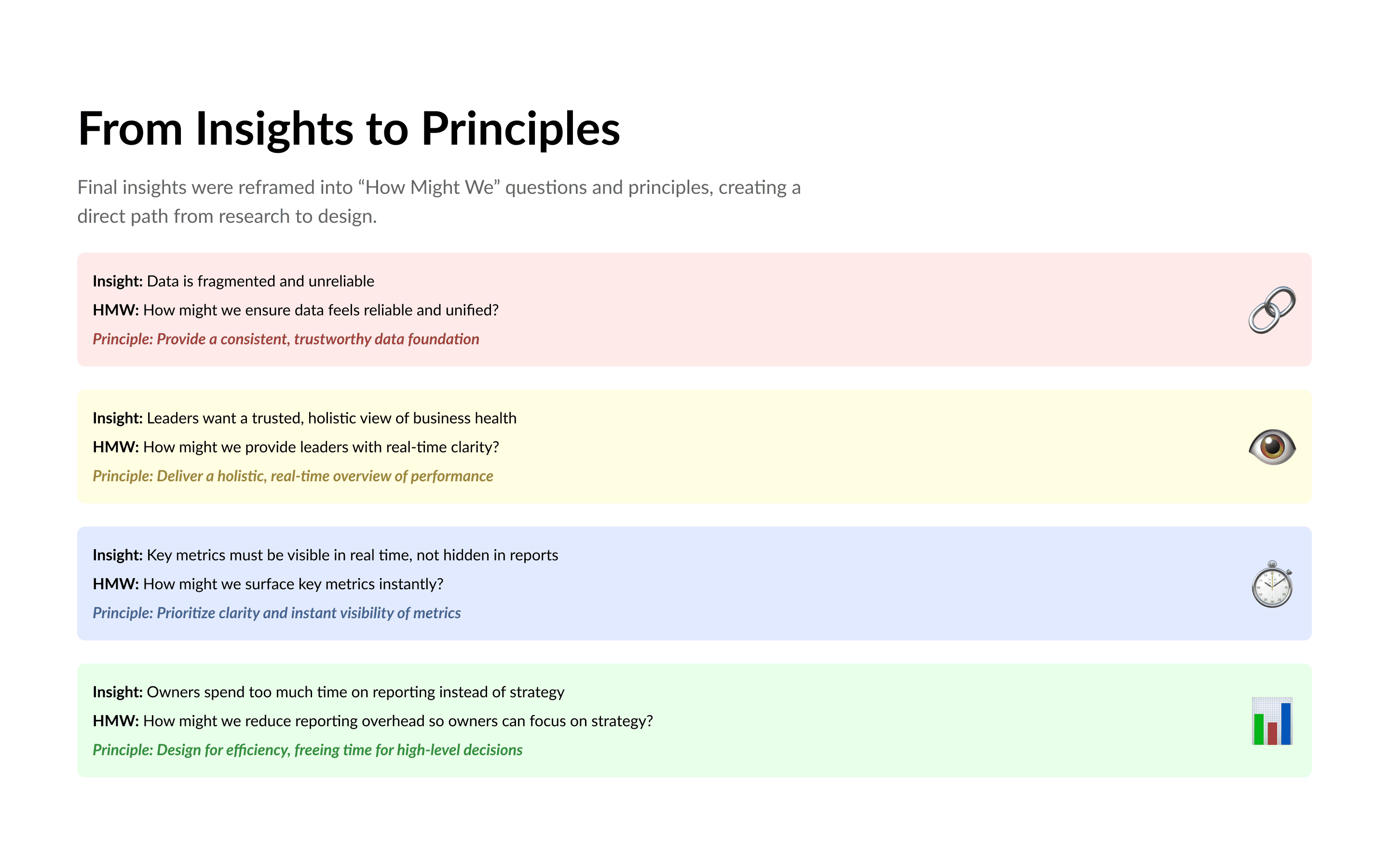
How Might We
How Might We
To connect research directly with design, I translated the final insights into “How Might We” questions and then derived guiding principles. This created a clear path from user pain points to actionable design decisions.
1.
Insight: Data is fragmented and unreliable
HMW: How might we ensure data feels reliable and unified?
Principle: Provide a consistent, trustworthy data foundation
2.
Insight: Leaders want a trusted, holistic view of business health
HMW: How might we provide leaders with real-time clarity?
Principle: Deliver a holistic, real-time overview of performance
3.
Insight: Key metrics must be visible in real time, not hidden in reports
HMW: How might we surface key metrics instantly?
Principle: Prioritize clarity and instant visibility of metrics
4.
Insight: Owners spend too much time on reporting instead of strategy
HMW: How might we reduce reporting overhead so owners can focus on strategy?
Principle: Design for efficiency, freeing time for high-level decisions
Design System
Design System
We built a scalable design system to support rapid prototyping and consistent UI patterns.
Library Evaluation:
Considered Ant Design and MUI
Chose MUI for better documentation and developer alignment
Goals:
Create reusable components
Ensure visual consistency
Accelerate collaboration with engineering

Approach
Approach
The primary approach in developing the design system was to structure it around Variables. Unlike the traditional method of relying on static style presets, Variables provide a more advanced and flexible way to define and store values such as colors, typography, and spacing. This structured approach allows for improved consistency and reduces the likelihood of errors across the system.
Another key benefit of using Variables is efficiency. A single update to a Variable is instantly reflected across all components where it is applied, significantly streamlining maintenance and ensuring scalability as the system evolves. Compared to the older style-based method, this approach offers a more reliable and future-oriented foundation for managing a design system.
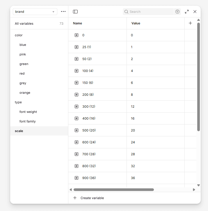
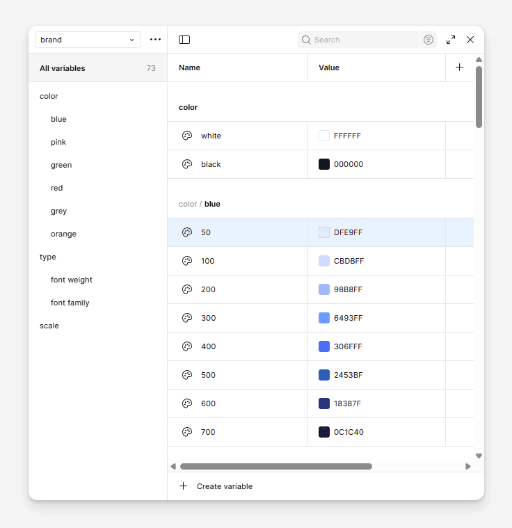
Variables organization
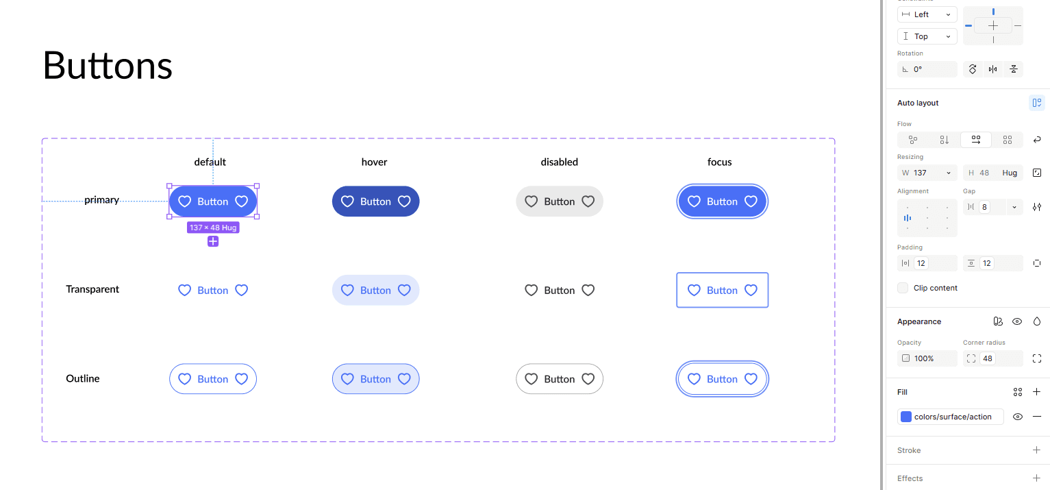
Components with applied variables
New Design
New Design
Our challenge was to create a clean, lightweight design — something that wouldn’t overwhelm users but still delivered a lot of data.
We had to show metrics, tables, graphs, signals — all without turning the interface into a stock trading terminal. The key was balance: enough information to be useful, but not so much that it became noise.
Chalenges
Chalenges
One of the challenges we faced was dealing with large volumes of tabular data. It was difficult to read, time-consuming to search through, and often unclear what a specific value actually represented. Was the result good or bad?
To solve this, we decided to add indicators that would provide context for each value. Since we already knew the average benchmark for every parameter in the database, we used it as a reference point. Based on this, we applied a simple color system: green for values above the norm and red for values below it. This made it immediately clear whether the result was positive or negative.
The idea was inspired by Excel, as it remains the most widely used tool for working with tables.
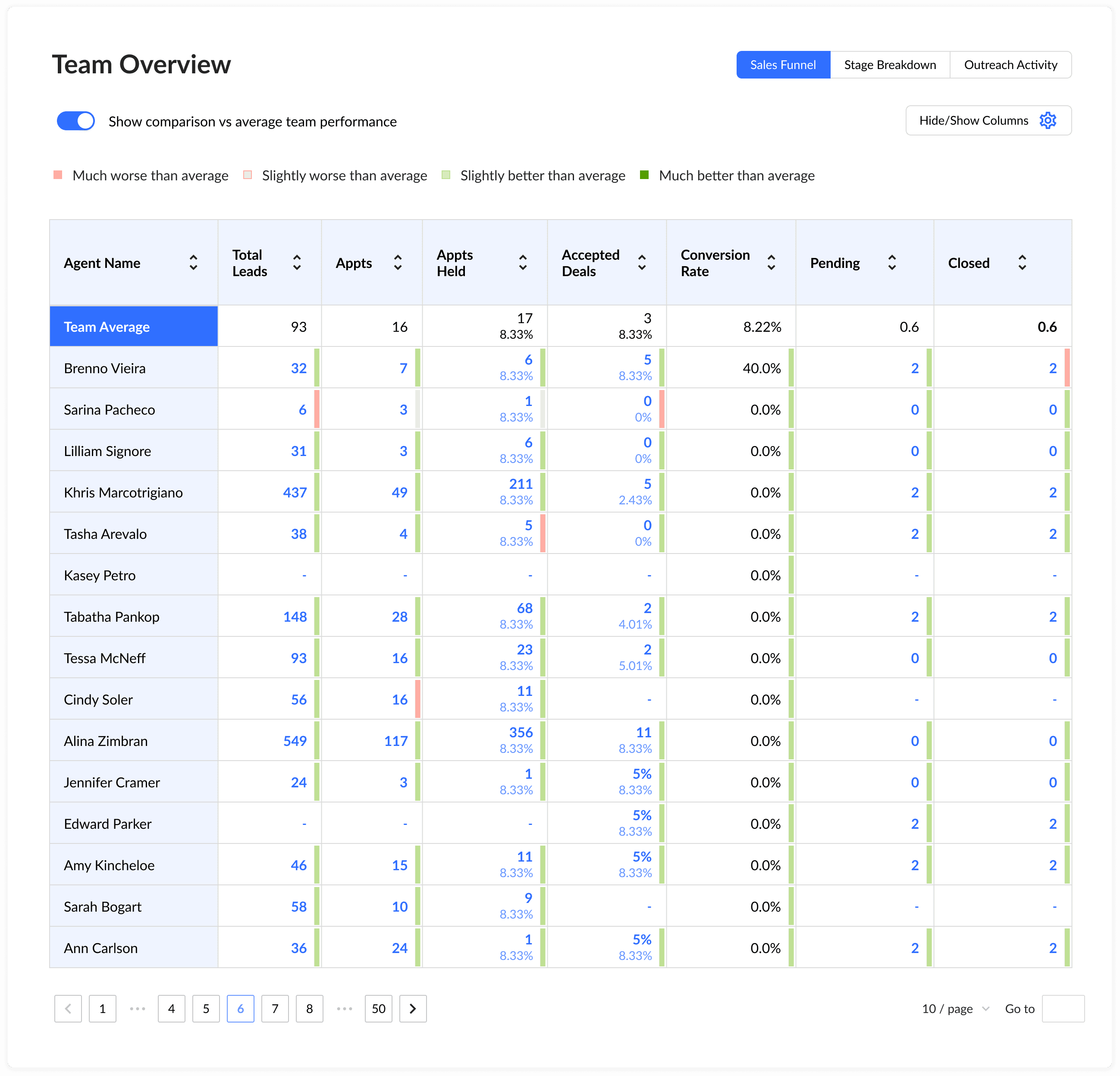
Table indicators showcase
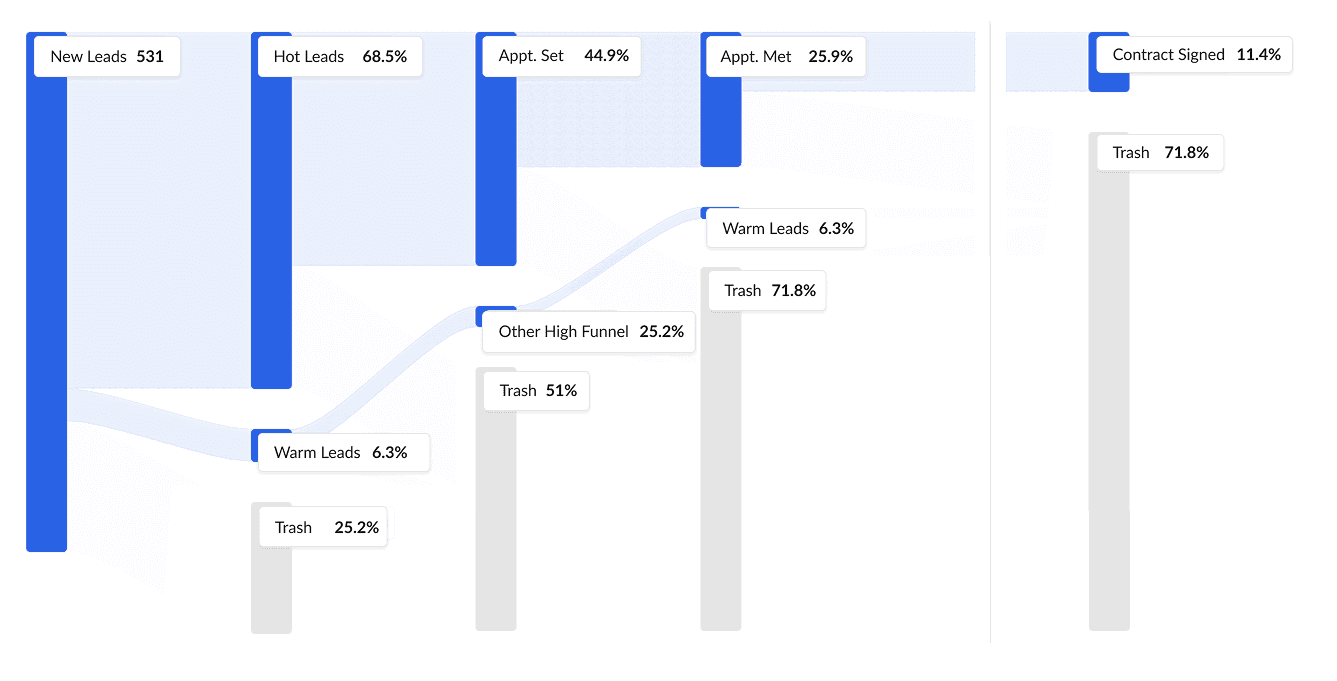
Another task was to visualize the sales funnel. Leads were entering the system, and we needed a clear way to track their progress at each stage — how many dropped off, how many advanced, and whether they were hot, warm, or cold. We went through several design iterations and eventually settled on the version that was both the most functional and the easiest to implement. Below, I’ll show the funnel’s evolution from the first draft to the final model.
Another task was to visualize the sales funnel. Leads were entering the system, and we needed a clear way to track their progress at each stage — how many dropped off, how many advanced, and whether they were hot, warm, or cold. We went through several design iterations and eventually settled on the version that was both the most functional and the easiest to implement. Below, I’ll show the funnel’s evolution from the first draft to the final model.
First iteration of funnel
First iteration of funnel
Second iteration of funnel
Second iteration of funnel
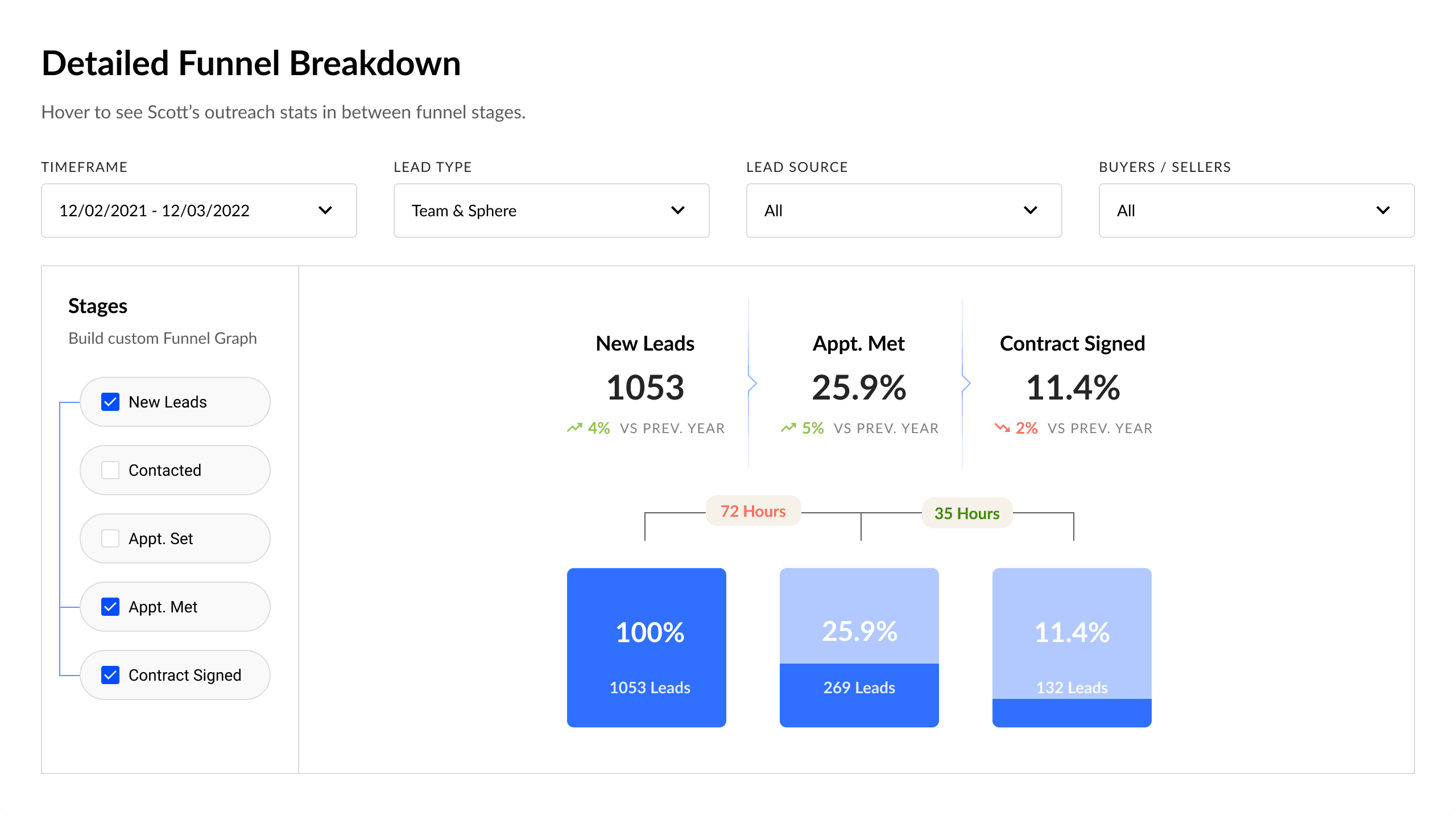
Third and final iteration of funnel
Final iteration of funnel
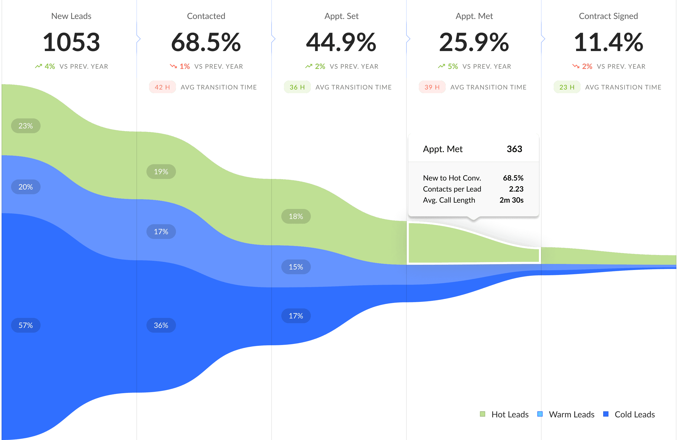
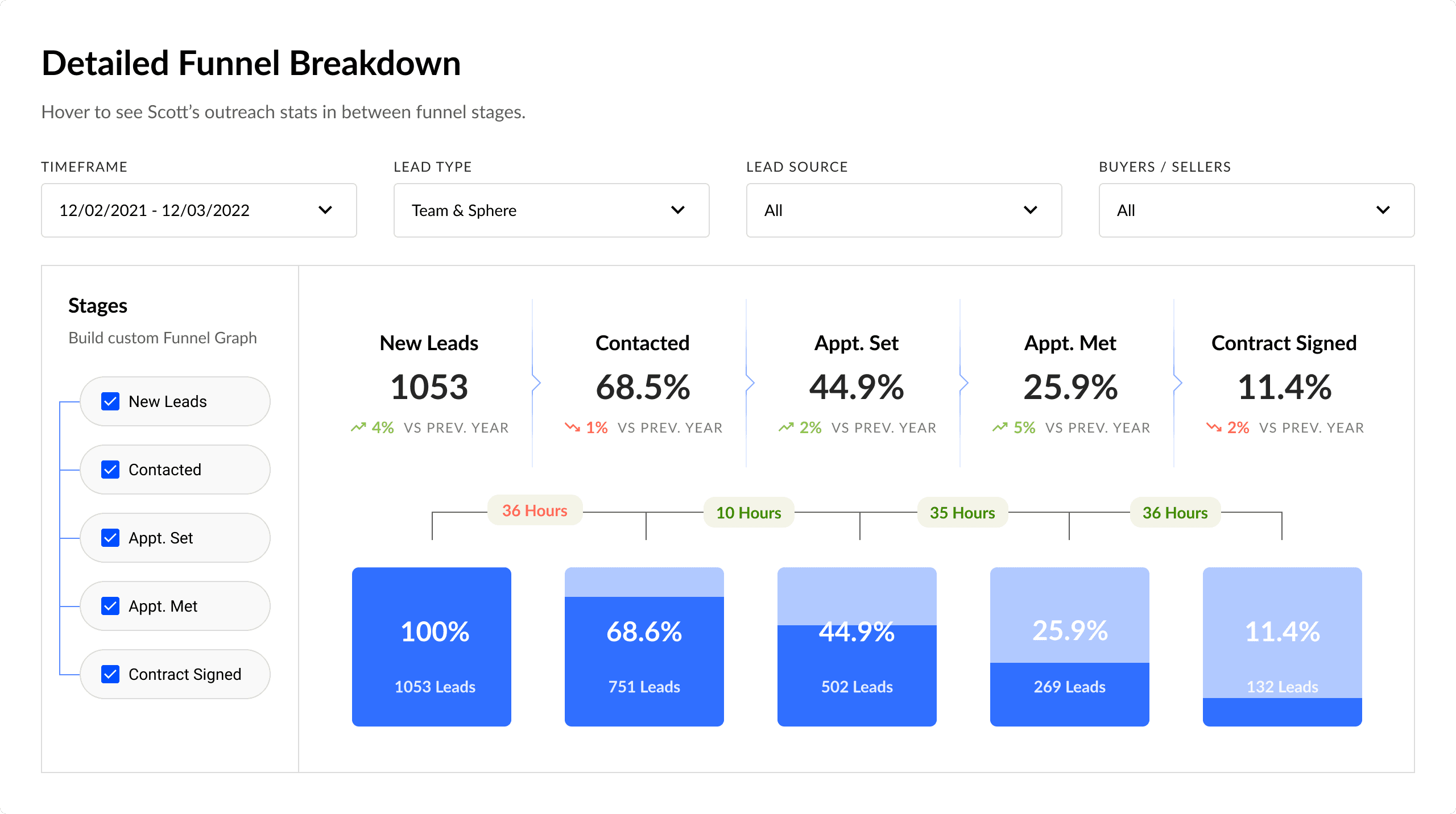
We built a Detailed Funnel Breakdown that lets you compose the funnel from the stages you need.
Full funnel shows all steps and, for each one, the lead volume, conversion from New Leads, and time to advance.
Custom funnel appears when users turn off extra steps. The logic stays intact:
Conversion remains cumulative — always calculated from New Leads.
Time is aggregated between visible stages (hidden intervals are summed).
Interface stays in sync: hide a stage — its card disappears too.
Filters (Timeframe, Lead Type, Lead Source, Buyers/Sellers) are applied before calculations. Result: users see only the stages that matter, while the metrics stay comparable and easy to read.
Custom funnel
Custom funnel
Other Designs
Other Designs
Instead of showing endless 15k-pixel pages, I highlighted a selection of key widgets and screens. The main focus was on data visualization — turning dry metrics into clear, digestible insights and drawing attention to problem areas. While the designs weren’t tested directly with end users, they received enthusiastic feedback from clients and their network. The work was also shared broadly within the team and beyond, gathering valuable input along the way.
Instead of showing endless 15k-pixel pages, I highlighted a selection of key widgets and screens. The main focus was on data visualization — turning dry metrics into clear, digestible insights and drawing attention to problem areas. While the designs weren’t tested directly with end users, they received enthusiastic feedback from clients and their network. The work was also shared broadly within the team and beyond, gathering valuable input along the way.
Outcomes
Outcomes
Even though the design process was moving much faster than development and we couldn’t conduct full user testing beyond prototypes, we organized several feedback sessions with stakeholders and received highly positive reactions. Along the way, we delivered a comprehensive design system, high-fidelity layouts, and a structured user-testing plan for the future. Since development was 4–6 months behind, the client decided to temporarily pause new design work until the engineering team could catch up.
Even though the design process was moving much faster than development and we couldn’t conduct full user testing beyond prototypes, we organized several feedback sessions with stakeholders and received highly positive reactions. Along the way, we delivered a comprehensive design system, high-fidelity layouts, and a structured user-testing plan for the future. Since development was 4–6 months behind, the client decided to temporarily pause new design work until the engineering team could catch up.
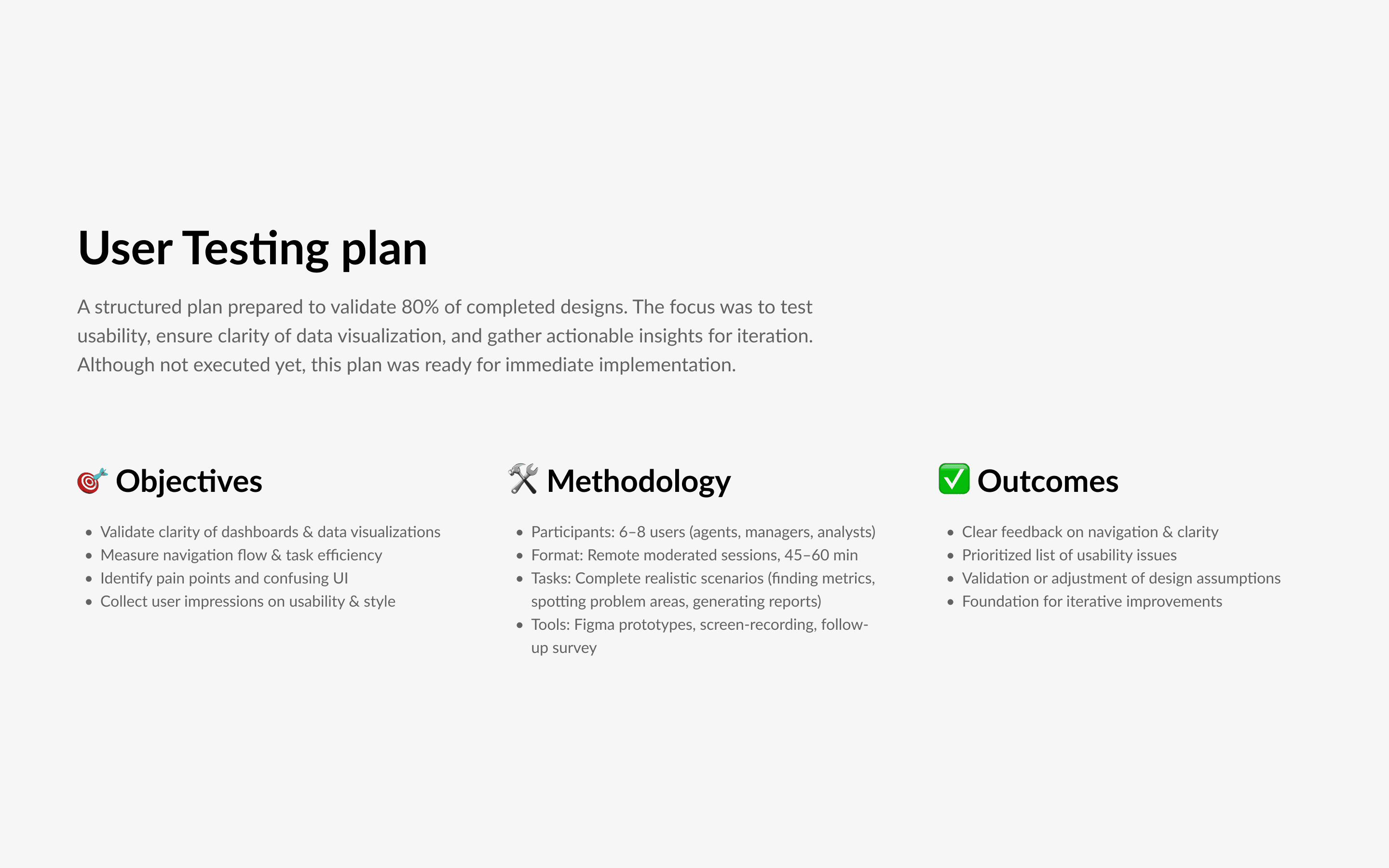
User Testing Plan
User Testing Plan
To ensure the usability and clarity of the product, I prepared a structured User Testing Plan once around 80% of the designs were complete. The goal was to validate our assumptions, uncover potential usability issues, and make sure the dashboards and visualizations would be intuitive for real users. Although the plan wasn’t executed at this stage, it was ready for implementation and served as a foundation for the next iteration cycle.
To ensure the usability and clarity of the product, I prepared a structured User Testing Plan once around 80% of the designs were complete. The goal was to validate our assumptions, uncover potential usability issues, and make sure the dashboards and visualizations would be intuitive for real users. Although the plan wasn’t executed at this stage, it was ready for implementation and served as a foundation for the next iteration cycle.

Reflections
Reflections
This project gave me a fantastic experience working with a client team that was truly exceptional — smart, collaborative, and genuinely enjoyable to work with.
Even though we didn’t complete the full design-to-release cycle, I’m proud of the work we did. There’s always room to improve, but I left the project feeling confident in our direction and hopeful for future collaboration.
Keep reading
Keep reading
More examples of design that drives results.
More examples of design that drives results.