Aurora
Aurora
by Clearstar
Designing clarity and control for background screening operations.
Designing clarity and control for background screening operations.
My Role
My Role
Senior UX/UI Designer
Senior UX/UI Designer
Deliverables
Deliverables
Design System
Design System
User Interview
User Interview
Research artifacts
Research artifacts
Prototypes
Prototypes
UX/UI
UX/UI
Team
Team
Lead Designer
Lead Designer
Senior UX/UI Designer
Senior UX/UI Designer
Middle UX/UI Designer
Middle UX/UI Designer
Project Manager
Project Manager
Dev Team
Dev Team
Context
Context
ClearStar is a company specializing in employee background screening. Aurora is their CRM platform that allows clients to order and manage screenings.
The project was a redesign of ClearStar’s legacy system from the 2000s. Over the years it had become slow, bug-ridden, and difficult to use. The client needed a modern solution that preserved core business logic while fixing usability issues and simplifying workflows.
Our design team was tasked with transforming Aurora into a streamlined, user-friendly system—maintaining functionality while delivering a faster and more intuitive experience.
Research Outcomes
Research Outcomes
Before I joined, the team had already conducted a research phase that included stakeholder interviews, system audits, and user feedback sessions with HR managers. The findings highlighted several recurring issues in the legacy system:
Slow and fragmented ordering flow — creating a background check could take 6–10 separate screens, often leading to abandoned orders.
Lack of transparency — users had no reliable way to track the status or expected completion time of screenings.
Overloaded forms — long, dense pages with repetitive fields increased errors and frustration.
Outdated navigation and reports — cluttered menus and a “graveyard” of links made it hard to find the right tools or reports.
Performance issues — pages were slow to load and felt unstable.
Baseline metrics from research:
Average order time: 12–15 minutes for a single flow (even longer for bulk orders).
Form error rate: 35–40% of submissions had validation issues or required re-entry.
Report mis-selection: Nearly 1 in 3 attempts ended with the wrong report being run.
System performance: Page load times of 5–7 seconds on average.
Navigation success rate: Fewer than 60% of users could find the right section on the first try.
These numbers became our benchmarks for improvement and guided the design priorities.
There is some of the old platform screens:

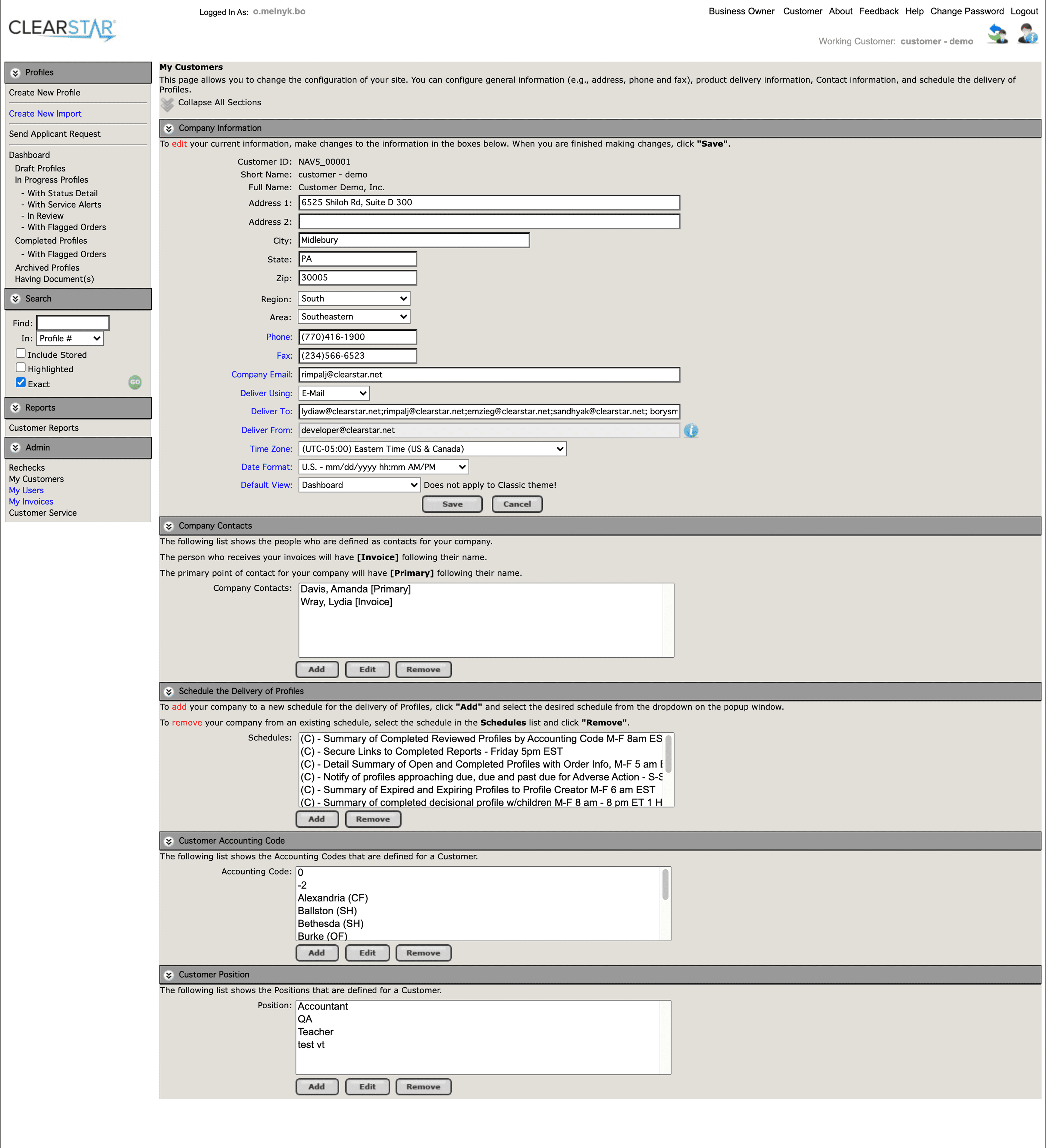
Example #1 of old system

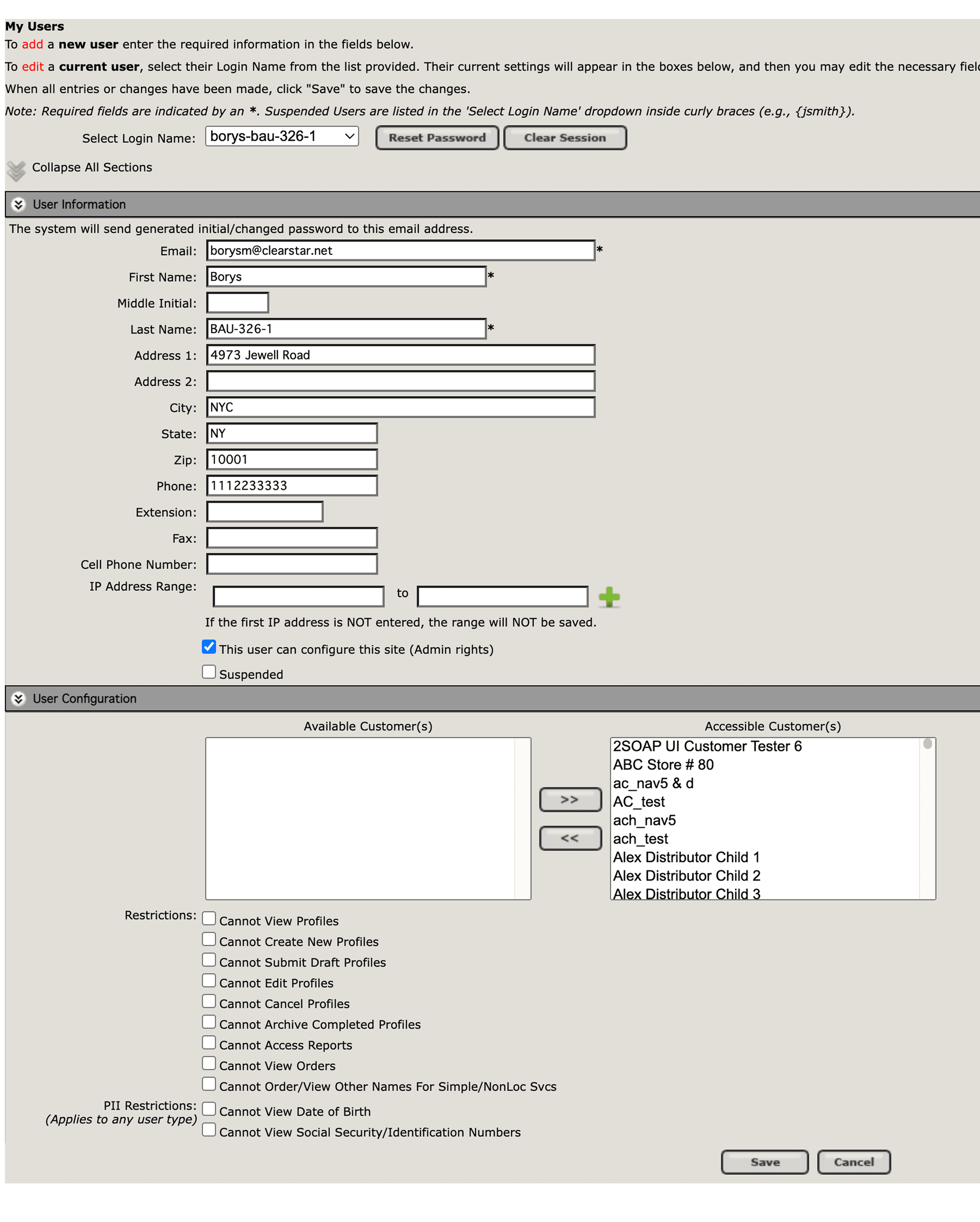
Example #2 of old system
Design Challenge
Design Challenge
The legacy system created constant friction for HR managers using Aurora to order background checks. Research revealed that the platform was:
Inefficient — background check flows stretched across 6–10 screens and often took 12–15 minutes to complete.
Unclear — users lacked visibility into status, ETA, or SLA, leading to frustration and uncertainty.
Error-prone — overloaded forms with repetitive fields produced a 35–40% error rate.
Confusing — navigation was cluttered, reports were buried in long lists, and nearly 1 in 3 reports selected was the wrong one.
Unreliable — performance lagged, with page load times of 5–7 seconds and fewer than 60% of users able to find what they needed on the first try.
Design objectives:
Streamline ordering into a faster, more predictable flow.
Provide transparency through clear status updates, ETAs, and SLA indicators.
Simplify forms to reduce input errors and rework.
Redesign navigation and reports for discoverability and efficiency.
Modernize the interface for speed, clarity, and trust.
Information Architecture
Information Architecture
After a thorough analysis of the legacy platform, the next step was to build an information architecture. This helped us map out how we were moving forward and assess the overall scope of work.
Our objective was to modernize the system while introducing key improvements to the user experience.
What was improved:
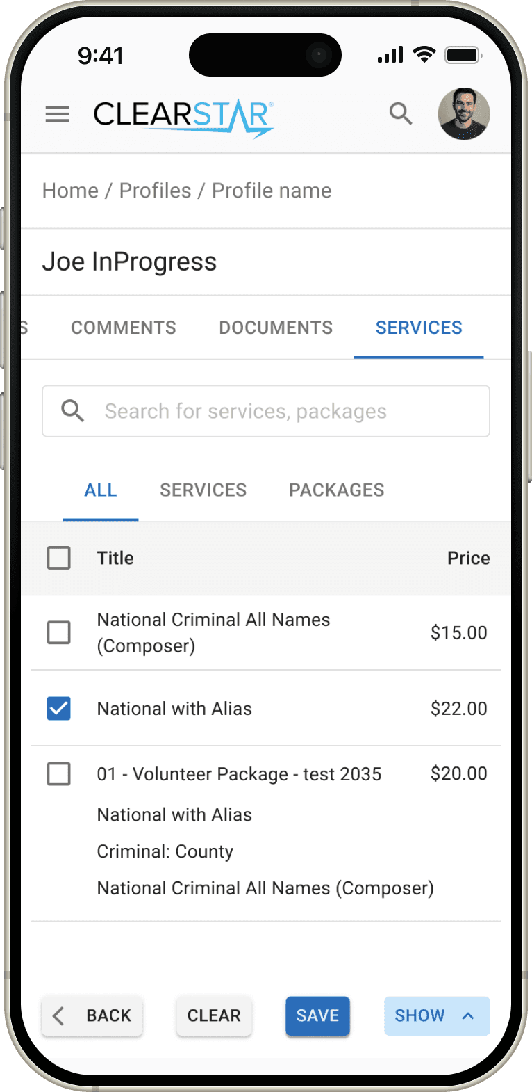
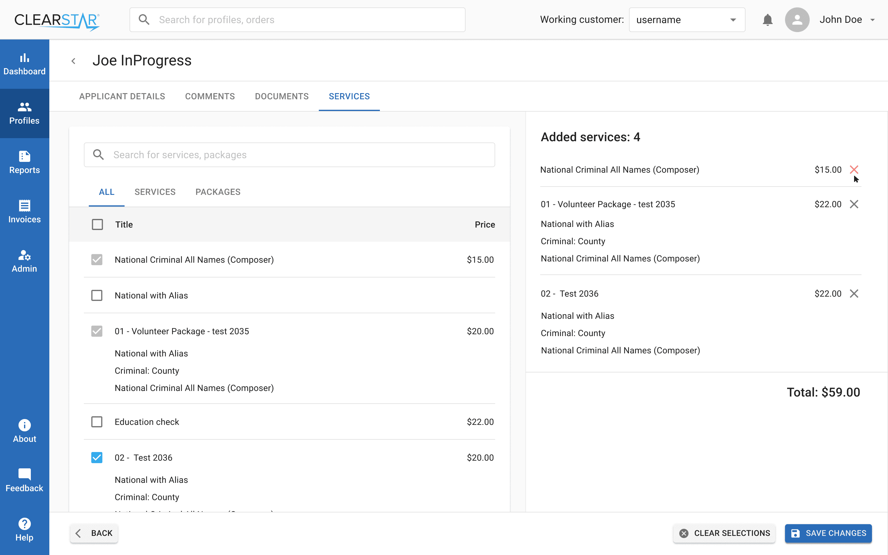
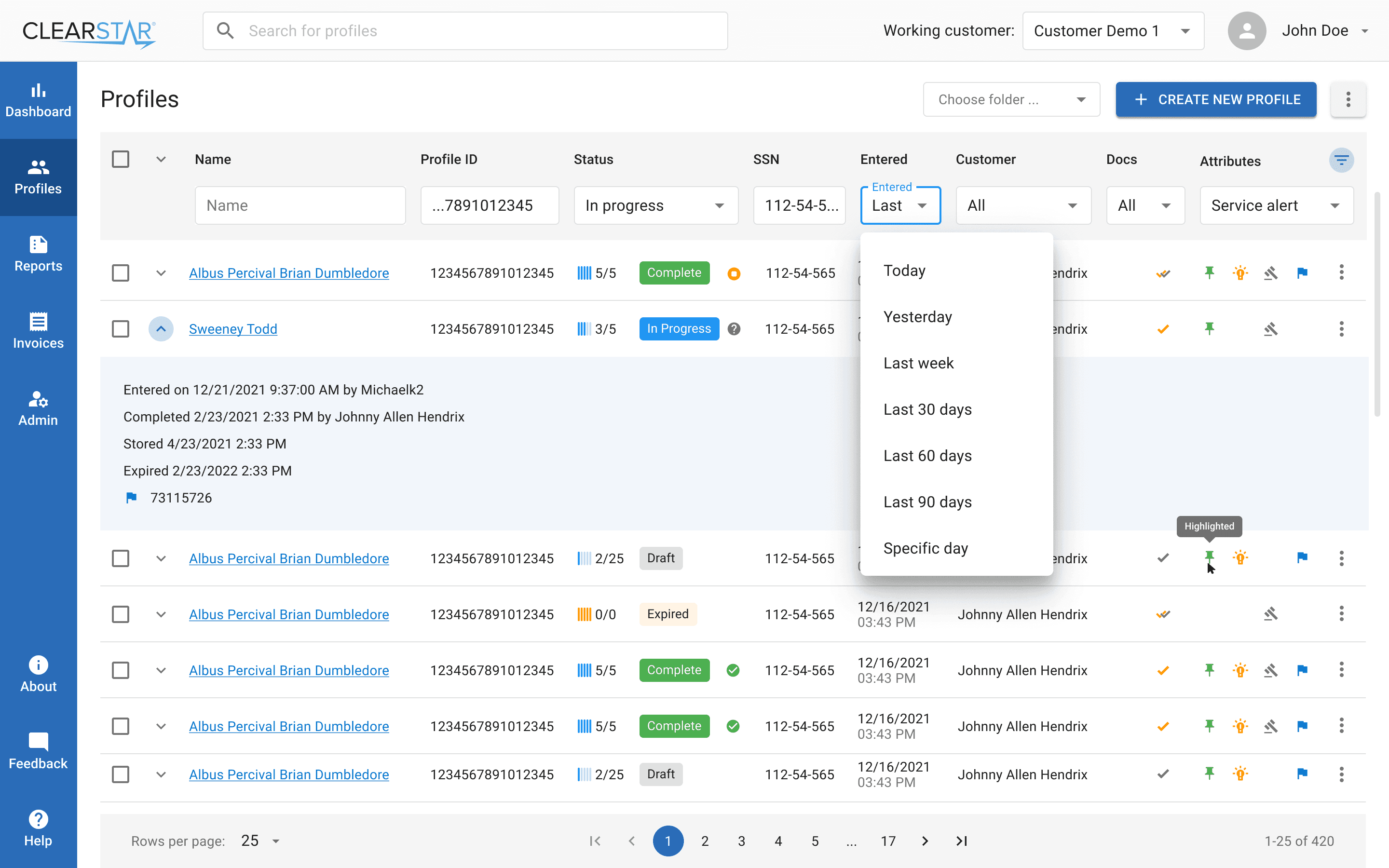
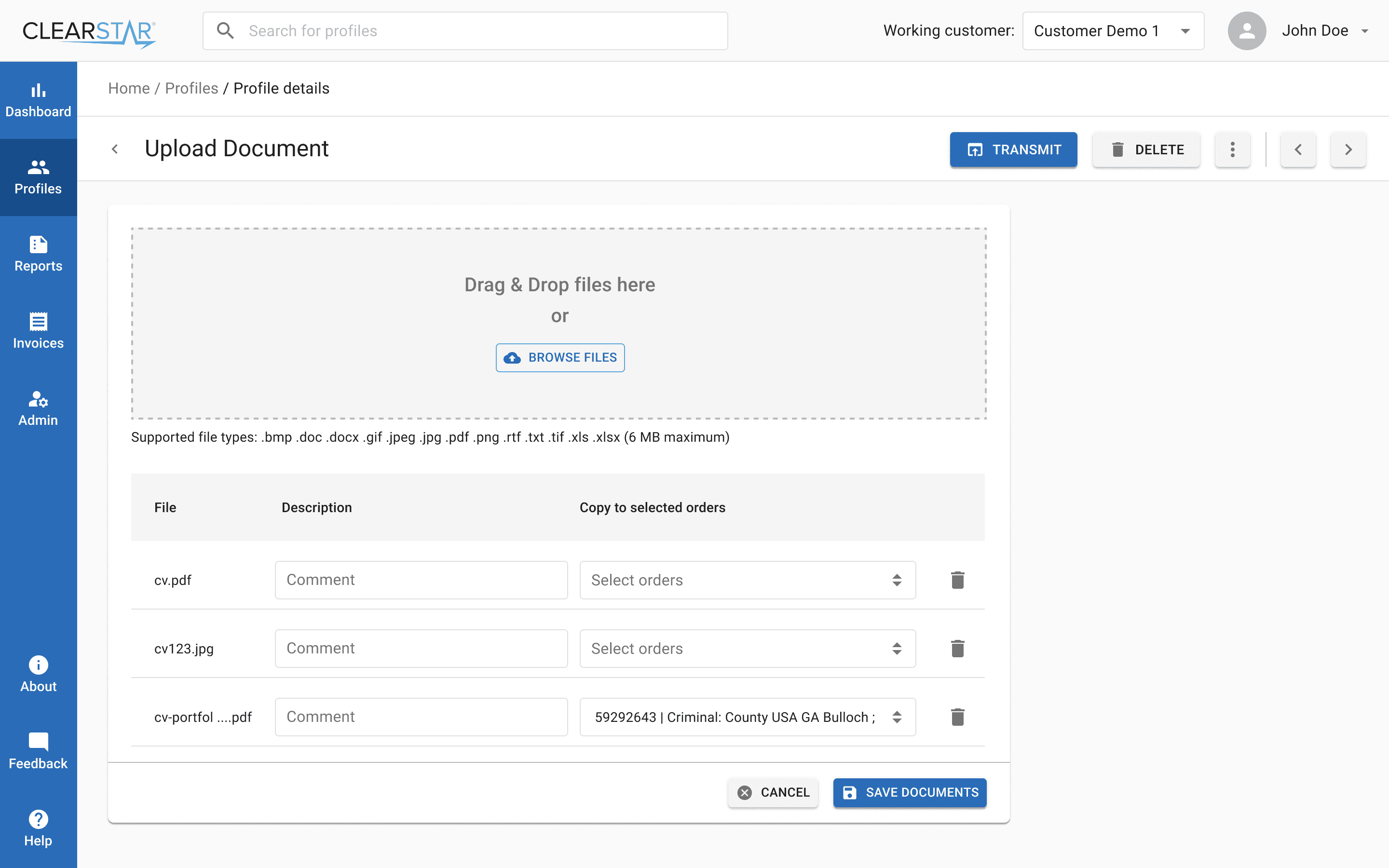
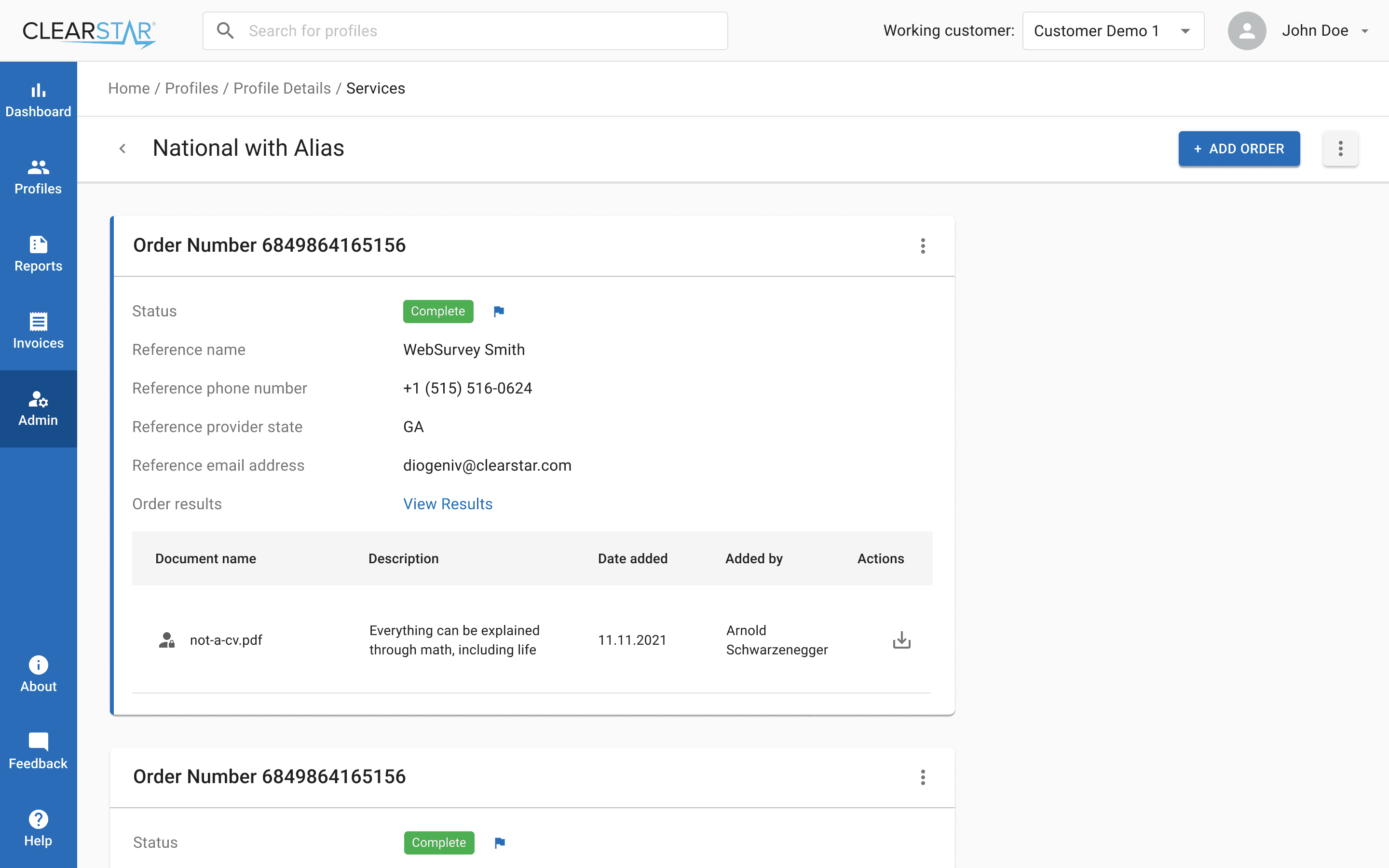
Services: We redesigned the process of adding services, making it more transparent and structured.
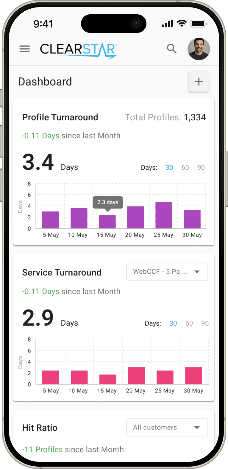
Dashboard: We introduced a comprehensive dashboard for monitoring profiles and tracking key metrics.
Profiles: The profile creation process was broken down into clear steps, making it more consistent and user-friendly.
Elastic Search: We integrated Elastic Search to significantly improve performance. The system contained tens of thousands of profiles, and a single search request used to take 30–40 seconds. We reduced this to just 1 second.
After a thorough analysis of the legacy platform, the next step was to build an information architecture. This helped us map out how we were moving forward and assess the overall scope of work.
Our objective was to modernize the system while introducing key improvements to the user experience.
What was improved:
Services: We redesigned the process of adding services, making it more transparent and structured.
Dashboard: We introduced a comprehensive dashboard for monitoring profiles and tracking key metrics.
Profiles: The profile creation process was broken down into clear steps, making it more consistent and user-friendly.
Elastic Search: We integrated Elastic Search to significantly improve performance. The system contained tens of thousands of profiles, and a single search request used to take 30–40 seconds. We reduced this to just 1 second.
Information flows in Miro
Component Library Decision
Component Library Decision
Before starting the design phase, we discussed with the development team which component library to adopt. The developers strongly recommended Material UI (MUI) because of its popularity, extensive documentation, and ease of use.
After reviewing the library myself, I confirmed that it fully covered all the required functionality. Choosing MUI allowed us to move faster and reduce development costs, while maintaining consistency and scalability across the product.
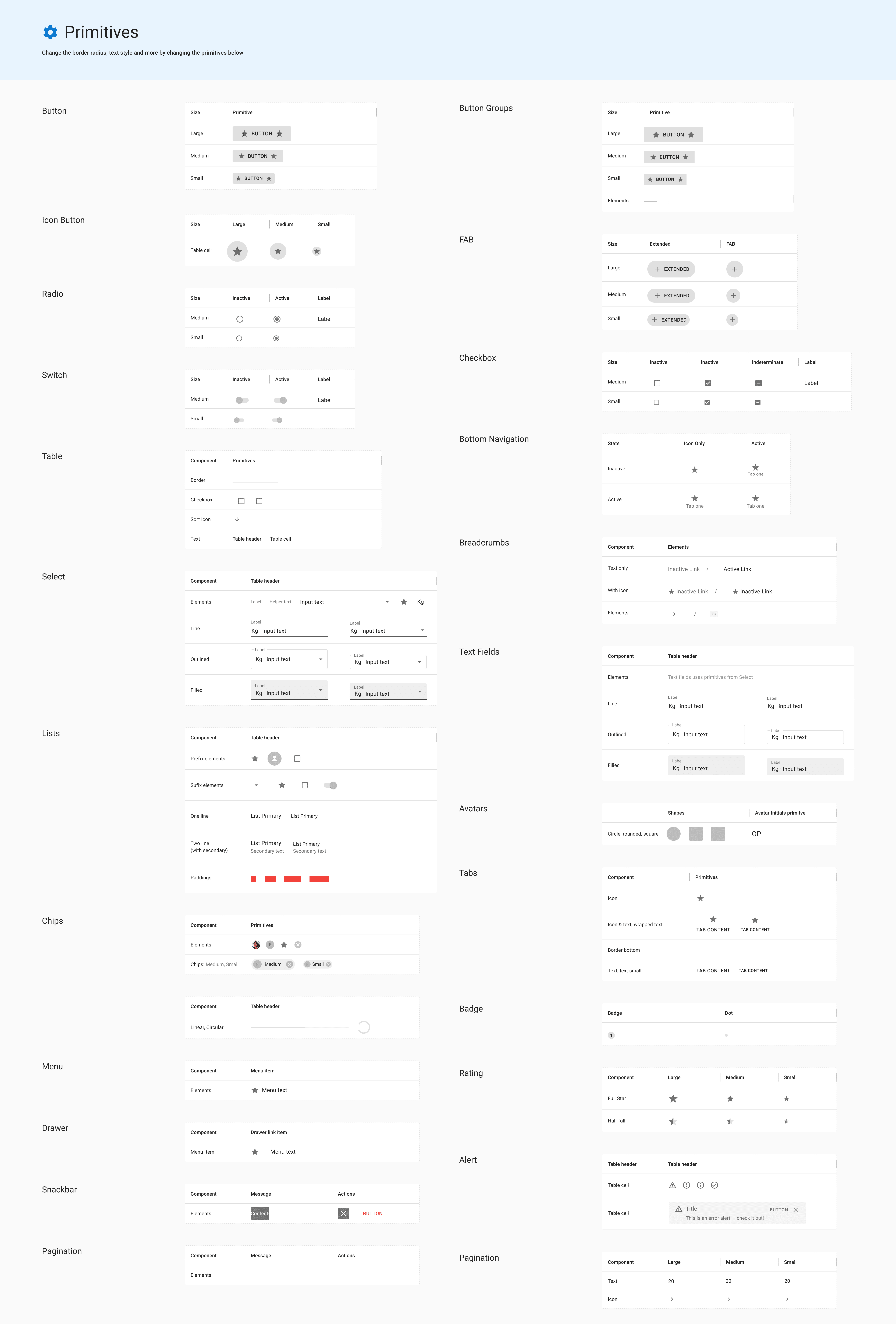
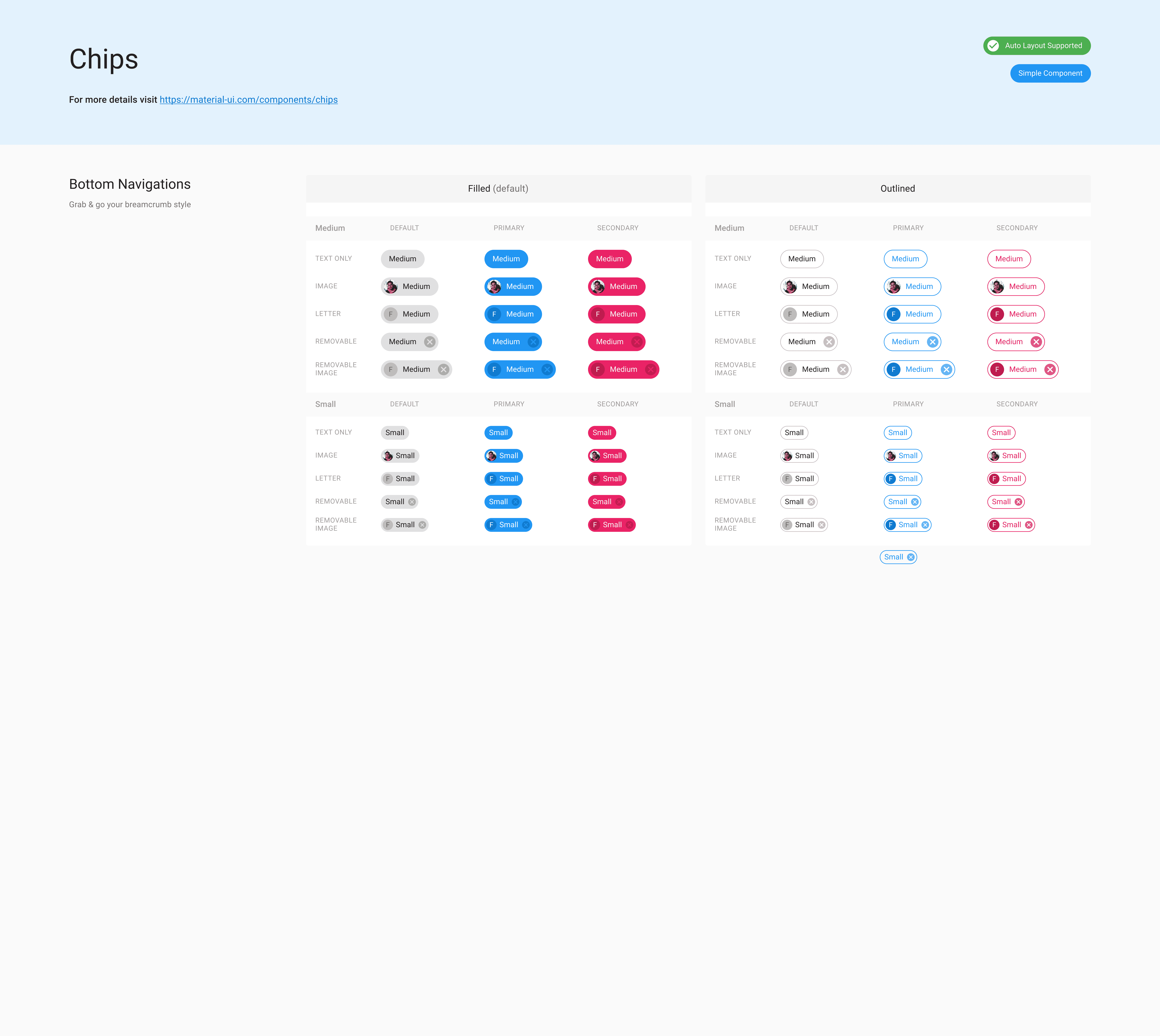
Design System
Design System
Our design system was built on top of Material UI, fully aligned with the MUI React library. We followed the established component guidelines to ensure consistency between our custom components and their React counterparts. At the same time, all brand-specific elements and visual identity were seamlessly integrated into the system.
Our design system was built on top of Material UI, fully aligned with the MUI React library. We followed the established component guidelines to ensure consistency between our custom components and their React counterparts. At the same time, all brand-specific elements and visual identity were seamlessly integrated into the system.
2022
Based on Material UI
Based on Material UI
AURORA
AURORA
DESIGN SYSTEM
DESIGN SYSTEM
Aurora Design System

Spacing map
Spacing maps
The components in the design system are built with strict consistency, following the same visual and functional rules. The library covers a wide range of use cases — from basic elements to more advanced patterns — so designers can create complex interfaces without stepping outside the system. This ensures scalability, clarity, and a reliable user experience
The components in the design system are built with strict consistency, following the same visual and functional rules. The library covers a wide range of use cases — from basic elements to more advanced patterns — so designers can create complex interfaces without stepping outside the system. This ensures scalability, clarity, and a reliable user experience
New Designs
New Designs
The redesign was not just a visual update but a rethinking of how the platform worked. Our main goal was to create a cleaner and more consistent experience that would reduce friction for users.
Key improvements included:
Improved readability through better typography and spacing
Consistent flows for creating and managing items across the system
Simplified interface with reduced clutter and clearer focus on actions
Clear taxonomy and navigation for faster orientation
Redesigned blocks to modernize the look and align with usability standards
Together, these changes made the platform easier to use, more predictable, and more scalable for future growth.


The Launch and Impact
The Launch and Impact
By November 11th, 2024, the redesigned Aurora platform officially launched, introducing a modernized interface, faster performance, and clearer navigation and reporting tools. The release was supported by usability testing and user surveys, which confirmed significant improvements in efficiency and clarity. Early adoption exceeded expectations, positioning Aurora as a trusted CRM solution for background screening.
By November 11th, 2024, the redesigned Aurora platform officially launched, introducing a modernized interface, faster performance, and clearer navigation and reporting tools. The release was supported by usability testing and user surveys, which confirmed significant improvements in efficiency and clarity. Early adoption exceeded expectations, positioning Aurora as a trusted CRM solution for background screening.
Key Metrics
Key Metrics
70%
70%
Reduced Order completion time
Reduced Order completion time
We restructured the 6–10 step process into a shorter flow with autosave and summaries, cutting completion time and reducing drop-offs.
We restructured the 6–10 step process into a shorter flow with autosave and summaries, cutting completion time and reducing drop-offs.
75%
75%
Reduced Form error rate
Reduced Form error rate
Dense forms with unclear labels were redesigned with hierarchy, inline validation, and smart defaults, preventing most common errors.
Dense forms with unclear labels were redesigned with hierarchy, inline validation, and smart defaults, preventing most common errors.
72%
72%
Improved System performance (page load)
Improved System performance (page load)
Modernized architecture and lighter UI components drastically improved speed and stability across the platform.
Modernized architecture and lighter UI components drastically improved speed and stability across the platform.
50%
50%
Improved Navigation success (first try)
Improved Navigation success (first try)
Simplified information architecture and global search raised first-try success rates, reducing wasted clicks and confusion.
Simplified information architecture and global search raised first-try success rates, reducing wasted clicks and confusion.
Conclusion
Conclusion
The Aurora redesign transformed a legacy system into a modern platform that finally matches the needs of today’s HR teams. What had once been slow, fragmented, and error-prone was re-imagined into streamlined flows, clearer structures, and a faster, more reliable interface.
We tackled the most painful points: ordering was reduced to a predictable and efficient process, statuses and reports became transparent and actionable, and navigation was rebuilt so users could find what they needed without friction. Alongside the technical improvements in performance and stability, the new design brought a sense of clarity and confidence back to daily work.
Aurora now stands not only as a functional CRM for background screening, but also as a product that clients can trust to scale with their operations. For me, this case demonstrates how redesigning a legacy system is not just about new visuals — it is about removing friction, aligning with user expectations, and creating a foundation for long-term growth.
Keep reading
Keep reading
More examples of design that drives results.
More examples of design that drives results.