Symphony AI
Symphony AI
Symphony AI is an enterprise AI company building industry-specific platforms that transform data into business value.
Symphony AI is an enterprise AI company building industry-specific platforms that transform data into business value.
CDS (Credit Decisioning System) helps banks optimize lending decisions by analyzing applicant data, building risk profiles, and predicting default likelihood. It guides approval, interest rates, and portfolio risk management.
CDS (Credit Decisioning System) helps banks optimize lending decisions by analyzing applicant data, building risk profiles, and predicting default likelihood. It guides approval, interest rates, and portfolio risk management.
My Role
My Role
Senior UX/UI Designer
Senior UX/UI Designer
Deliverables
Deliverables
Research artifacts
Research artifacts
Prototypes
Prototypes
UX/UI
UX/UI
Team
Team
Senior Product Designer
Senior Product Designer
Middle UX/UI Designer
Middle UX/UI Designer
Business Analyst
Business Analyst
What was the problem?
What was the problem?
Banks had plenty of raw data in spreadsheets, but no clear way to turn it into insights. Important decisions — who to lend to, under what terms, and how to collect repayments — were based on scattered numbers without real analysis. The product was built to transform that data into clear statistics and patterns, giving banks a single place to understand their customers, reduce risk, and make smarter credit decisions.
Banks had plenty of raw data in spreadsheets, but no clear way to turn it into insights. Important decisions — who to lend to, under what terms, and how to collect repayments — were based on scattered numbers without real analysis. The product was built to transform that data into clear statistics and patterns, giving banks a single place to understand their customers, reduce risk, and make smarter credit decisions.
Our goal as design team
Our goal as design team
Our main task was to create an MVP product for later demonstration to potential investors. To achieve this, the client assembled a team of designers and business analysts to promote their services across different industries. We focused on two directions: banking loans (CLS) and pharmaceutical distribution (CDS).
Our main task was to create an MVP product for later demonstration to potential investors. To achieve this, the client assembled a team of designers and business analysts to promote their services across different industries. We focused on two directions: banking loans (CLS) and pharmaceutical distribution (CDS).
CLS & CDS
CLS & CDS
As mentioned earlier, we developed two MVPs: CLS (Credit & Loan Strategy) and CDS (Clinical Drug Supply). CLS focused on banking systems, while CDS addressed the efficient distribution of pharmaceuticals. Let’s start our review with CLS.
As mentioned earlier, we developed two MVPs: CLS (Credit & Loan Strategy) and CDS (Clinical Drug Supply). CLS focused on banking systems, while CDS addressed the efficient distribution of pharmaceuticals. Let’s start our review with CLS.
01. CLS
01. CLS
Input Information
Input Information
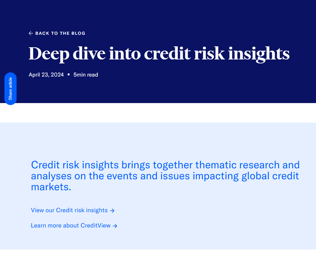
As introductory material, we used documentation provided by the client along with several articles from reputable sources. Our goal at this stage was to gain the necessary knowledge to understand the subject matter. We couldn’t move forward until we had a clear grasp of what we were dealing with.
As introductory material, we used documentation provided by the client along with several articles from reputable sources. Our goal at this stage was to gain the necessary knowledge to understand the subject matter. We couldn’t move forward until we had a clear grasp of what we were dealing with.

Study Materials
Design Inspiration
Design Inspiration
After gaining domain knowledge and exploring the raw data, we turned to existing tools for inspiration. Products such as Power BI, Tableau, and other analytics platforms provided references for how complex financial data can be structured and visualized. We studied their patterns in dashboards, charts, and user interactions to understand what feels intuitive for analysts. Our goal was not to replicate these tools but to adapt the best practices to the specific needs of the credit domain.
After gaining domain knowledge and exploring the raw data, we turned to existing tools for inspiration. Products such as Power BI, Tableau, and other analytics platforms provided references for how complex financial data can be structured and visualized. We studied their patterns in dashboards, charts, and user interactions to understand what feels intuitive for analysts. Our goal was not to replicate these tools but to adapt the best practices to the specific needs of the credit domain.
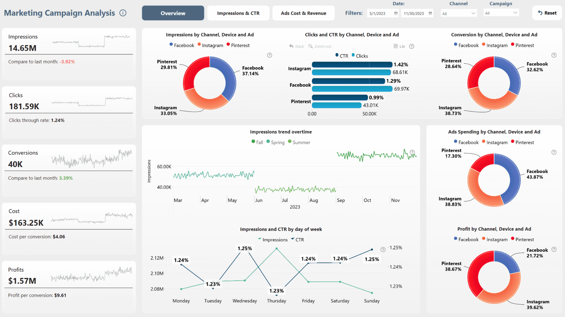
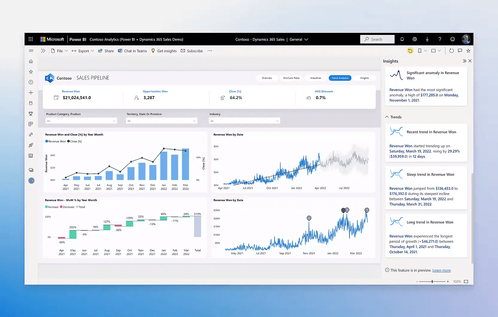
PowerBI examples


Tableau examples
What we learned
What we learned
After reviewing documentation and exploring reference tools like Power BI, we identified several patterns:
Raw data is powerful but becomes overwhelming without structure.
Analysts need to compare groups side by side, not just see global numbers.
Visualization styles (cards, funnels, drill-downs) make data instantly understandable.
Clear hierarchies (from KPI overview → drill-down) reduce cognitive load.
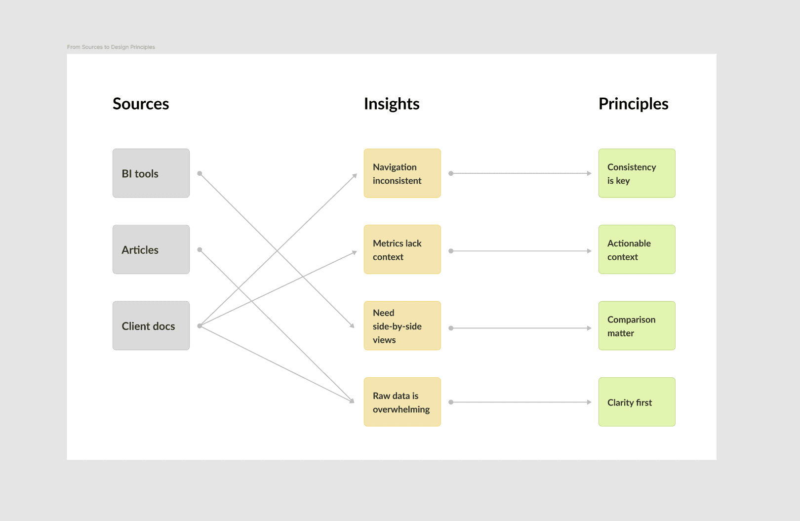
From Insights to Design Principles
CLS MVP Sctructure
CLS MVP Sctructure
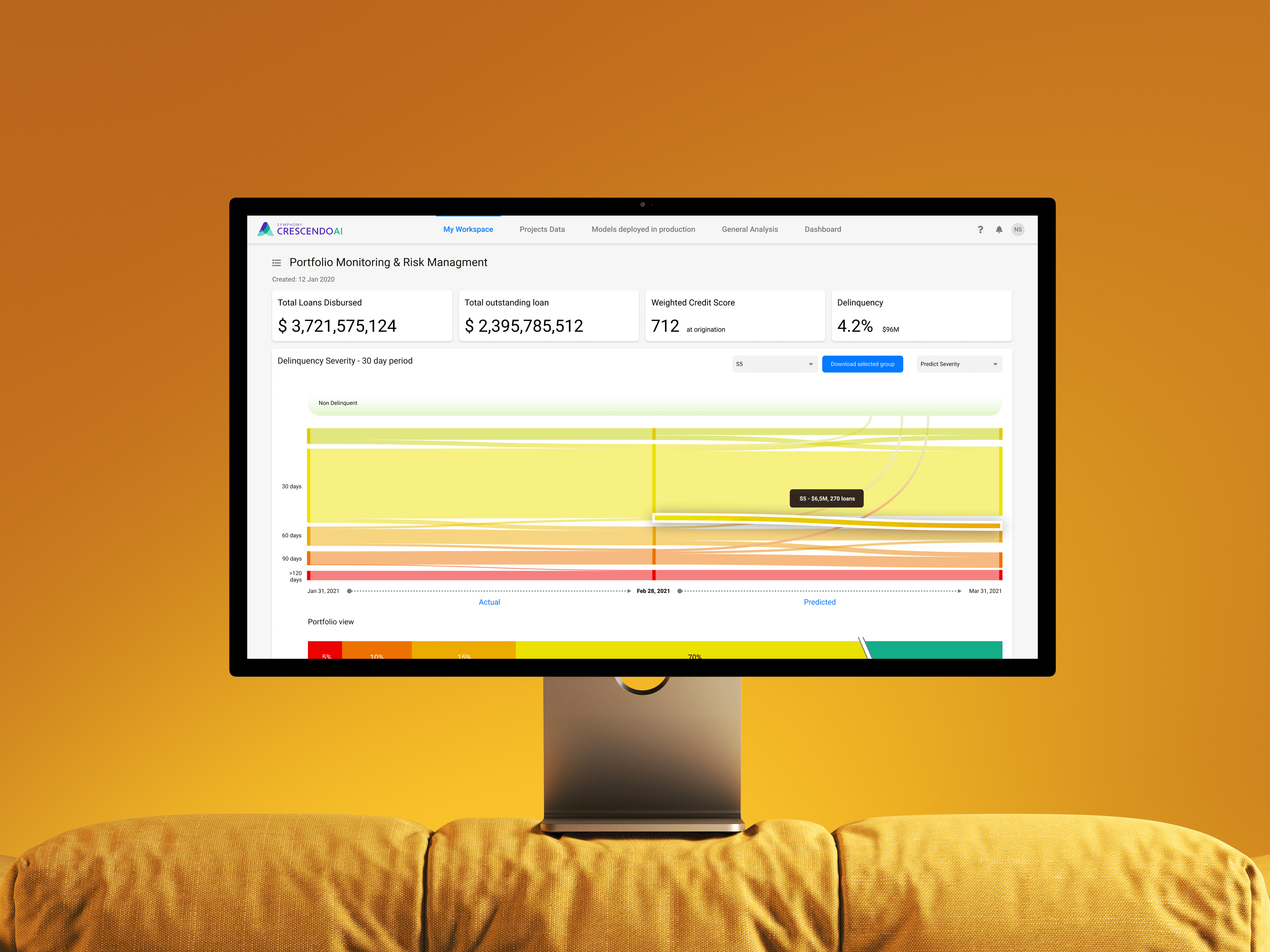
CLS covers the full credit lifecycle through six modules and a C-level dashboard. From data upload to loan insights, pricing scenarios, portfolio monitoring, and collections, each part turns raw spreadsheets into clear insights and actionable steps.
CLS covers the full credit lifecycle through six modules and a C-level dashboard. From data upload to loan insights, pricing scenarios, portfolio monitoring, and collections, each part turns raw spreadsheets into clear insights and actionable steps.
Information flows in Miro
Design Foundation — Material UI
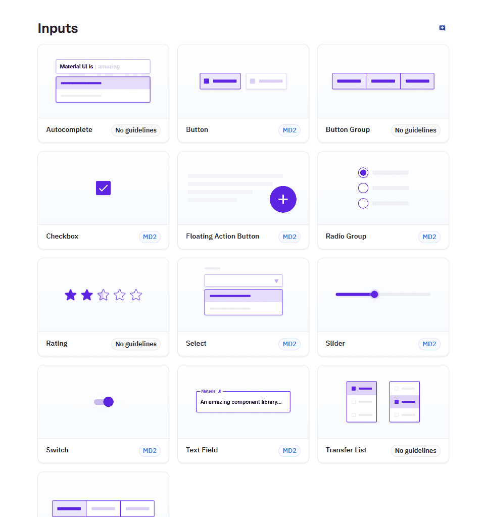
Design Foundation — Material UI
To ensure consistency and scalability, we built the design system on top of Material UI. This choice aligned with the development stack and gave us a well-documented component library. It allowed us to focus on domain-specific patterns instead of reinventing basic components.
To ensure consistency and scalability, we built the design system on top of Material UI. This choice aligned with the development stack and gave us a well-documented component library. It allowed us to focus on domain-specific patterns instead of reinventing basic components.

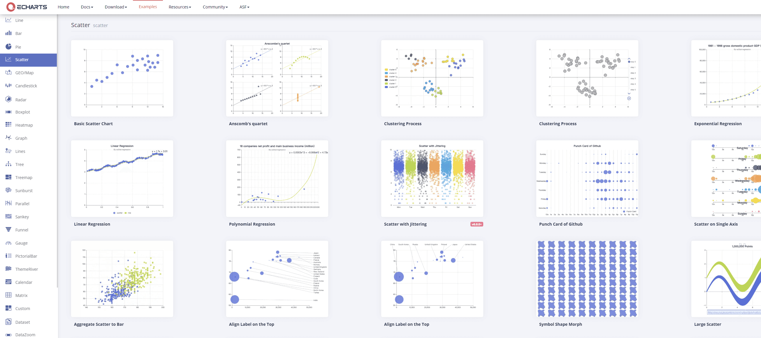
Charting Stack — Apache ECharts
Charting Stack — Apache ECharts
To handle advanced analytics, we integrated Apache ECharts through its React wrapper. This choice gave us access to complex visualizations — including Sankey flows, scatter plots, treemaps, heatmaps, and funnels — that go far beyond the basics of standard UI kits.
ECharts allowed us to:
Match the visual style with the Material theme for a consistent look.
Support interactivity such as drill-downs, tooltips, and hover states.
Scale from simple KPIs to large datasets without performance issues.
This stack ensured that the system could present both clarity for executives and granular insights for analysts, within the same design framework.
E-charts react components example
From Foundations to
User Interfaces
From Foundations to User Interfaces
With the architecture mapped and the design stack selected, the next step was to bring the product to life through real screens. At this stage our focus shifted from abstract structures and principles to practical user journeys. Every decision we had made earlier — about clarity, comparability, context, and consistency — now had to be expressed visually.
The challenge was to translate complex datasets into interfaces that felt intuitive for different roles inside the bank. Executives needed a clear portfolio overview and immediate red flags. Analysts needed the ability to drill into borrower segments, trace risk drivers, and test scenarios. Collection managers needed visual priorities and forecasts to guide daily actions.
We started by designing the Credit Insights Overview, the central entry point of the system, and then expanded into detailed modules that supported exploration, pricing, and collections. Each flow was built not just to display numbers, but to help the user act on them with confidence.

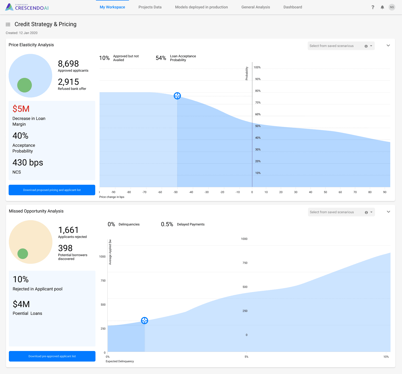
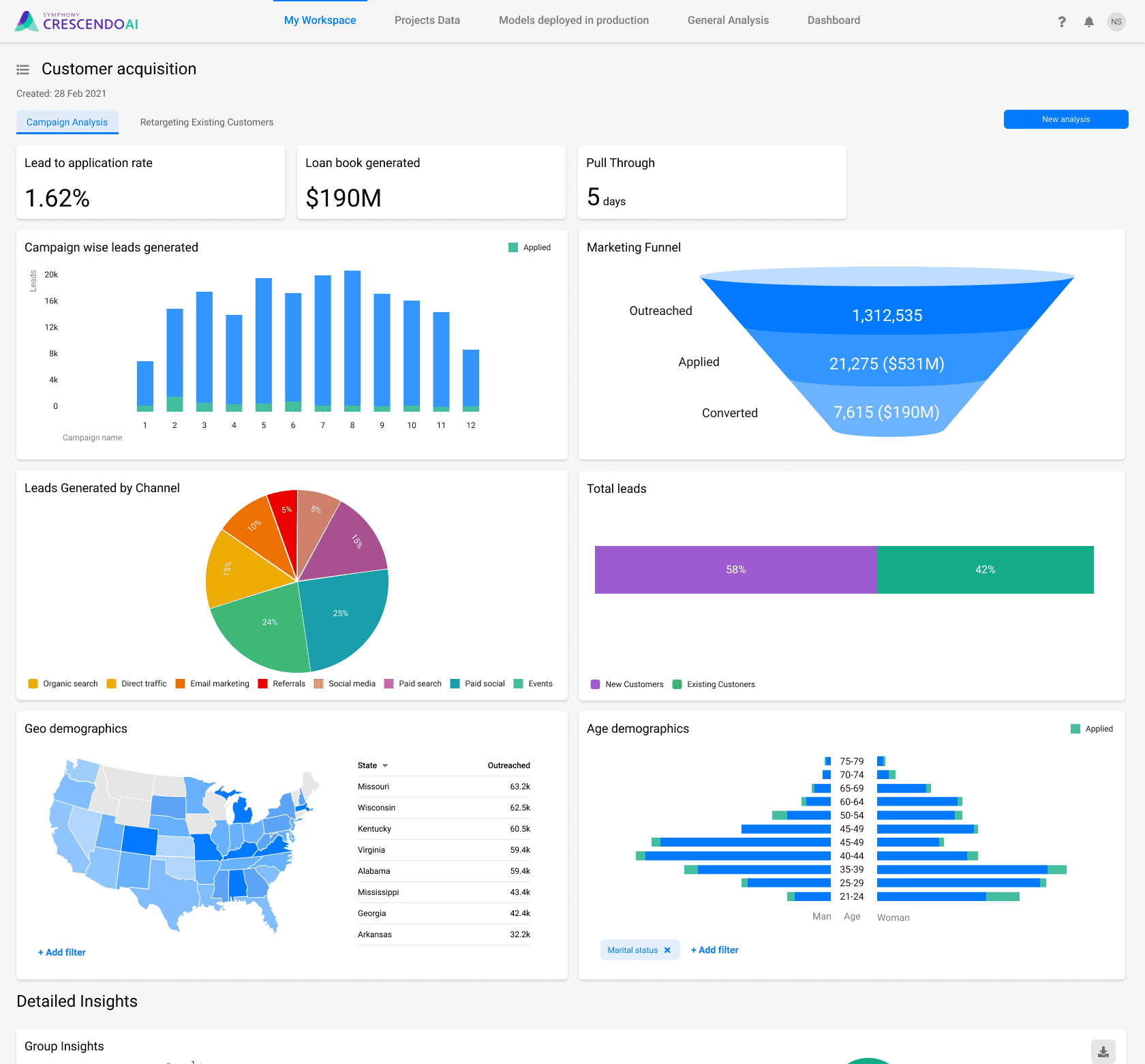
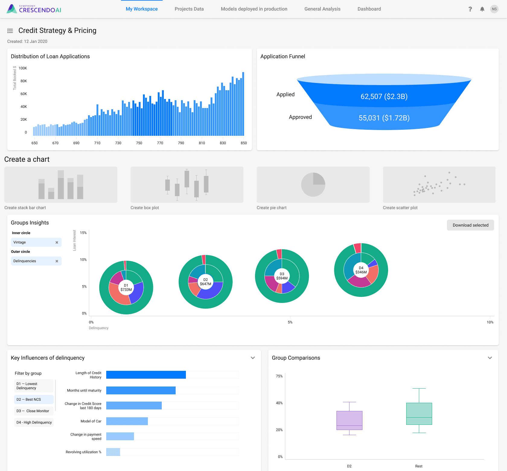

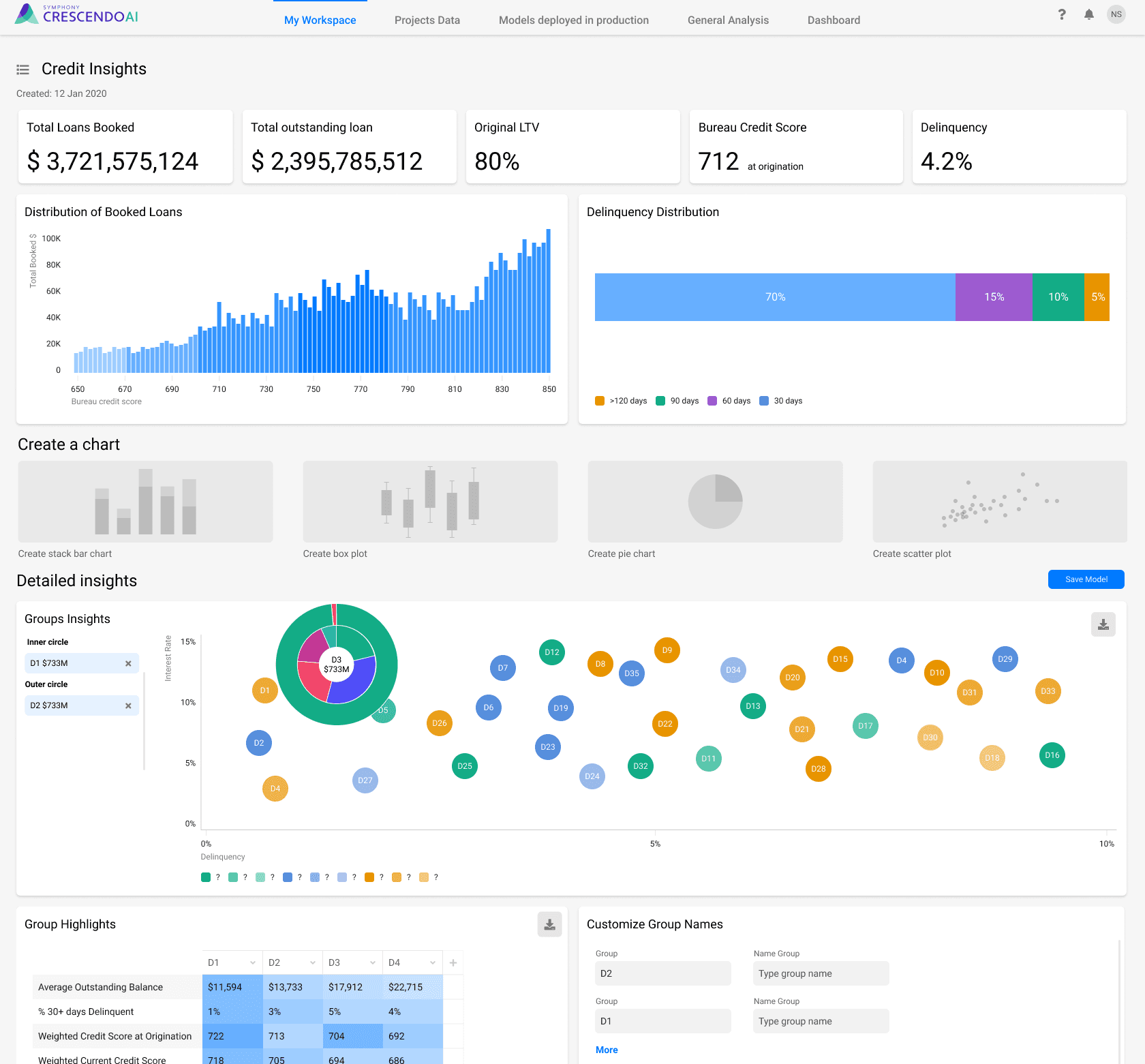
CLS design screens
CLS design screens
Selected product screens showcasing core workflows, analytics, and business insights.
Selected product screens showcasing core workflows, analytics, and business insights.
CLS
02. CDS

Understanding Pharmaceutical
Distribution
Understanding Pharmaceutical Distribution
Before designing the CDS platform, we studied how modern pharmaceutical distribution networks operate. The system behind drug delivery is complex, involving multiple stakeholders — manufacturers, wholesalers, distributors, pharmacies, hospitals, and regulators — all connected by strict compliance and data-tracking standards.
Every medication follows a traceable path:
Manufacturing & Packaging – drugs are produced and serialized for identification.
Wholesale & Distribution – authorized distributors purchase, store, and transport medicines across regions while maintaining temperature control and product integrity.
Retail & Institutional Delivery – pharmacies and hospitals receive products, verify authenticity, and manage inventory levels.
End Consumption & Reporting – patient use and sales data feed back into the supply chain for forecasting and regulation.

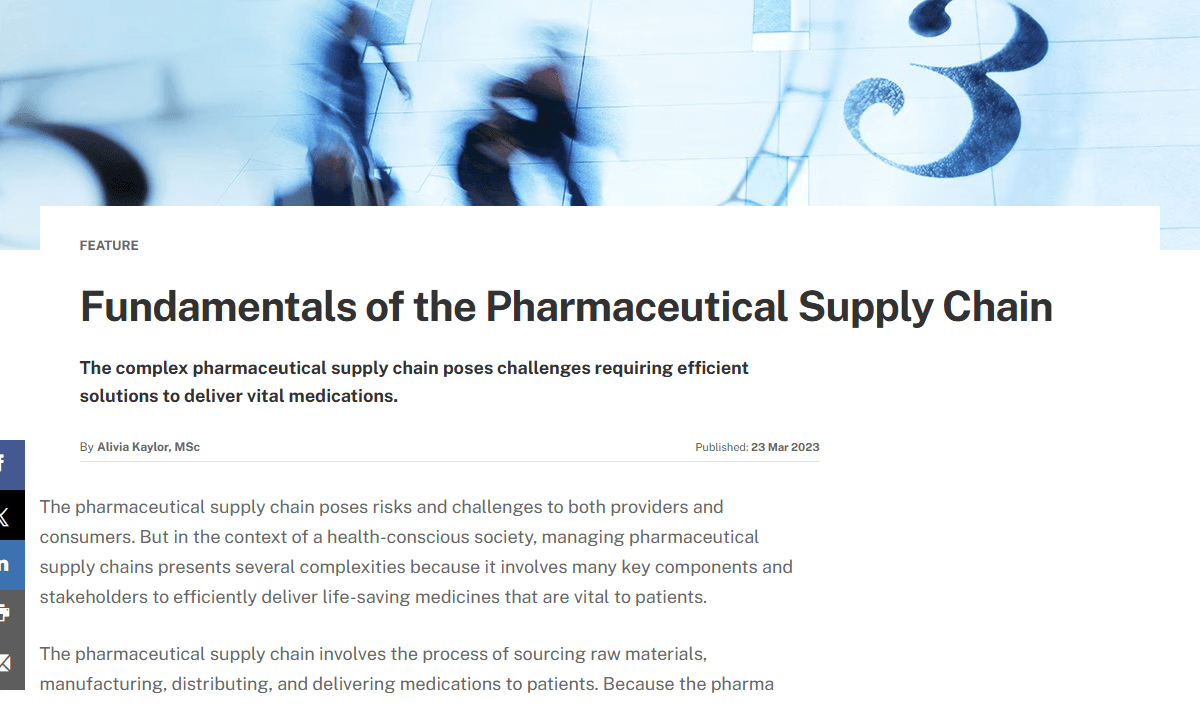
Some of the articles we studied before start of working

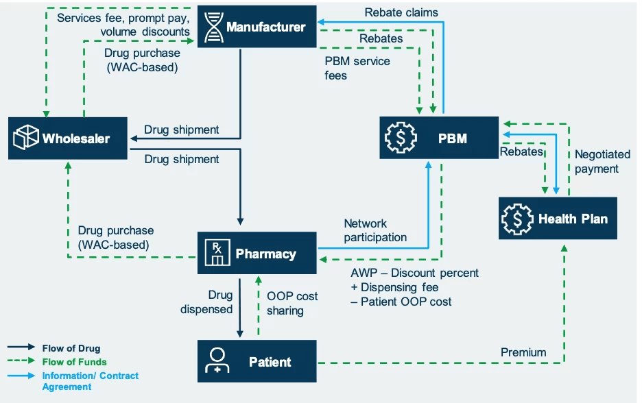
"Avalere" diagram as example of Drug Supply Chain
Designs
Designs
After our team gained a solid understanding of the industry, we moved on to the design phase. The CDS interfaces were built upon the foundations and patterns we had already developed for CLS.
Let's start from Log In and Navigation screens:
After our team gained a solid understanding of the industry, we moved on to the design phase. The CDS interfaces were built upon the foundations and patterns we had already developed for CLS.
Let's start from Log In and Navigation screens:
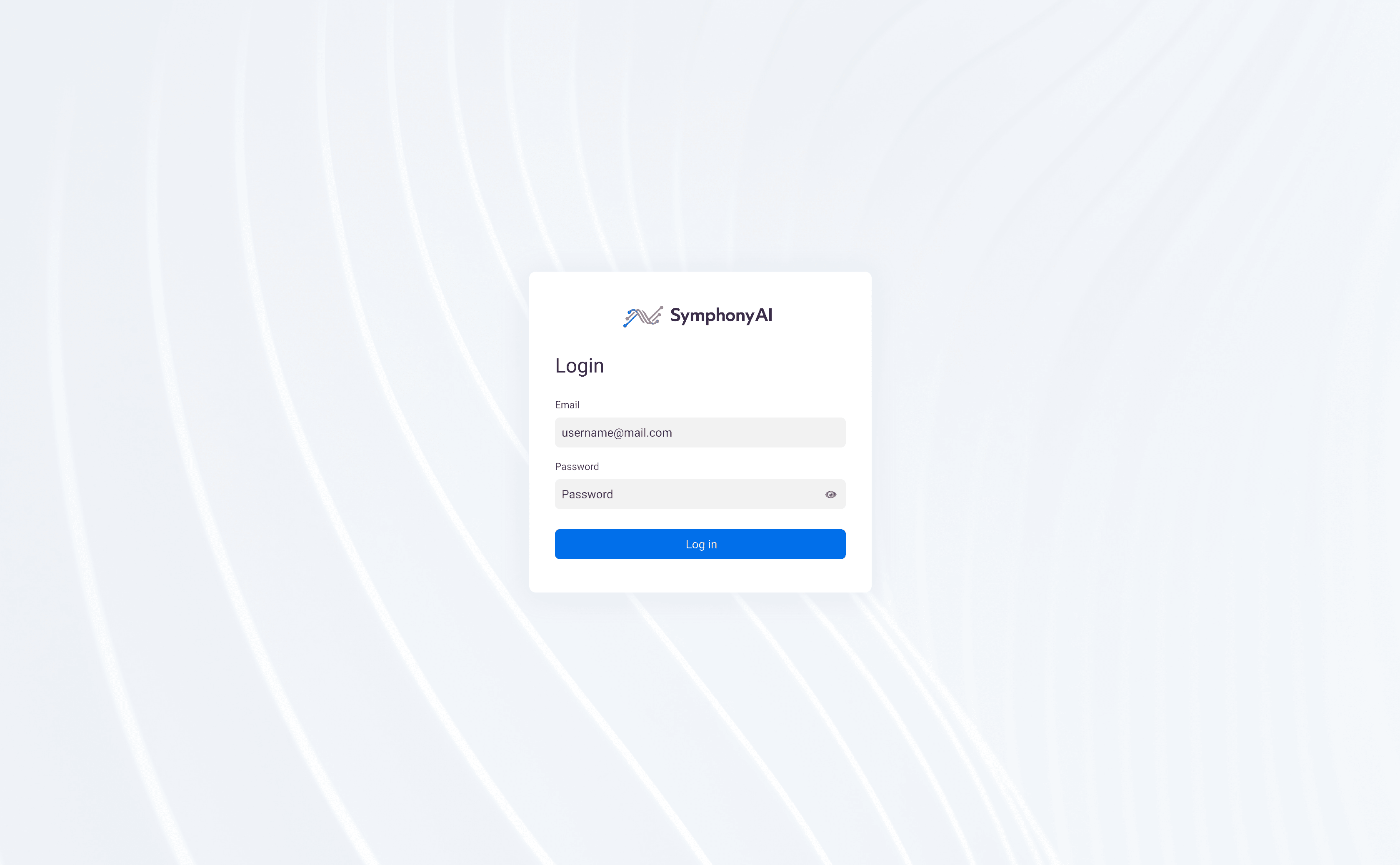
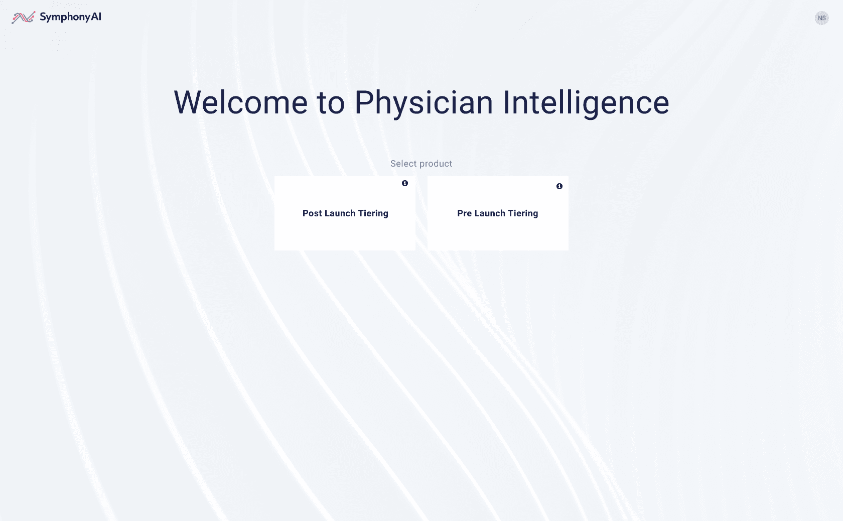
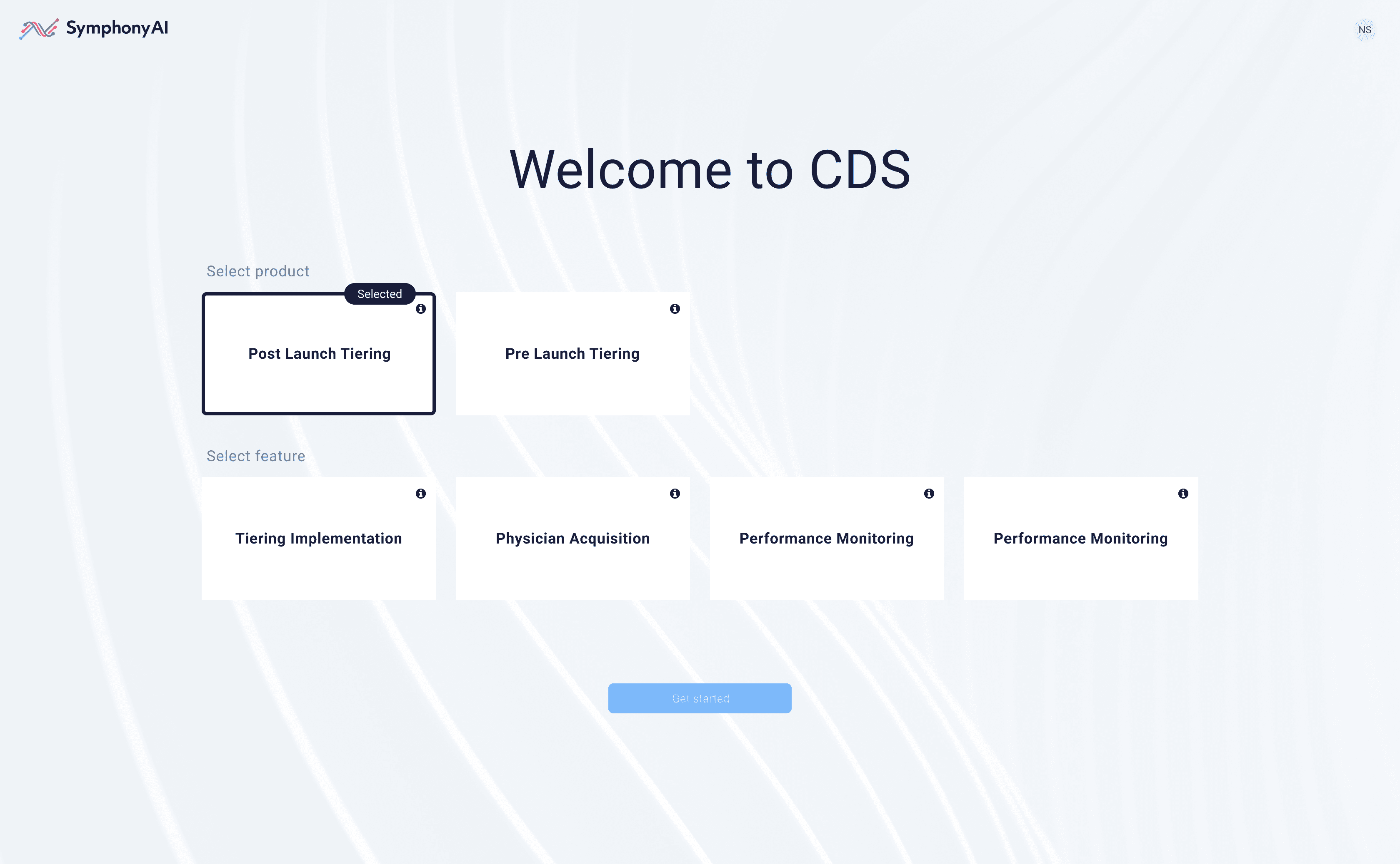
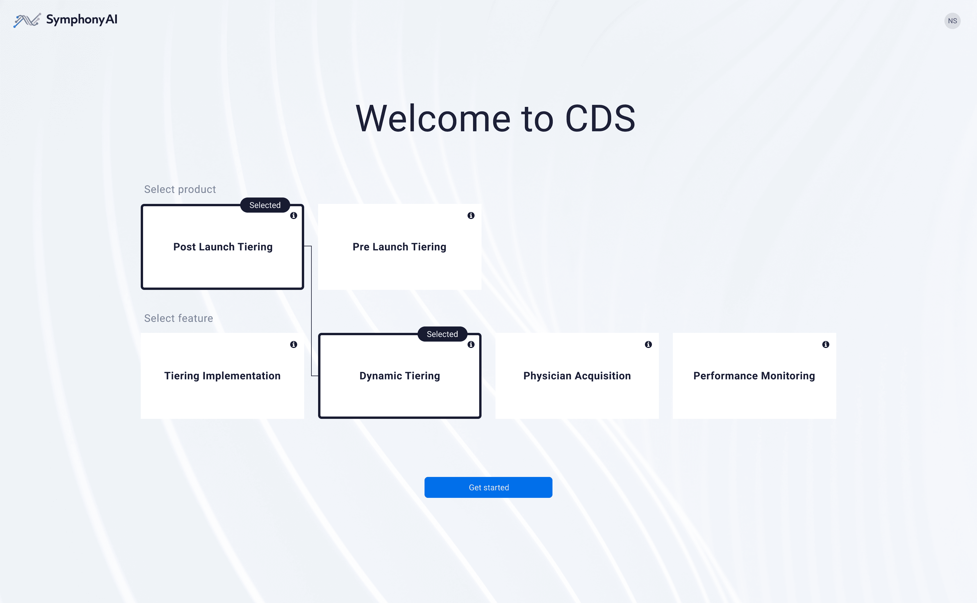
Modular entry flow for multi-product platform
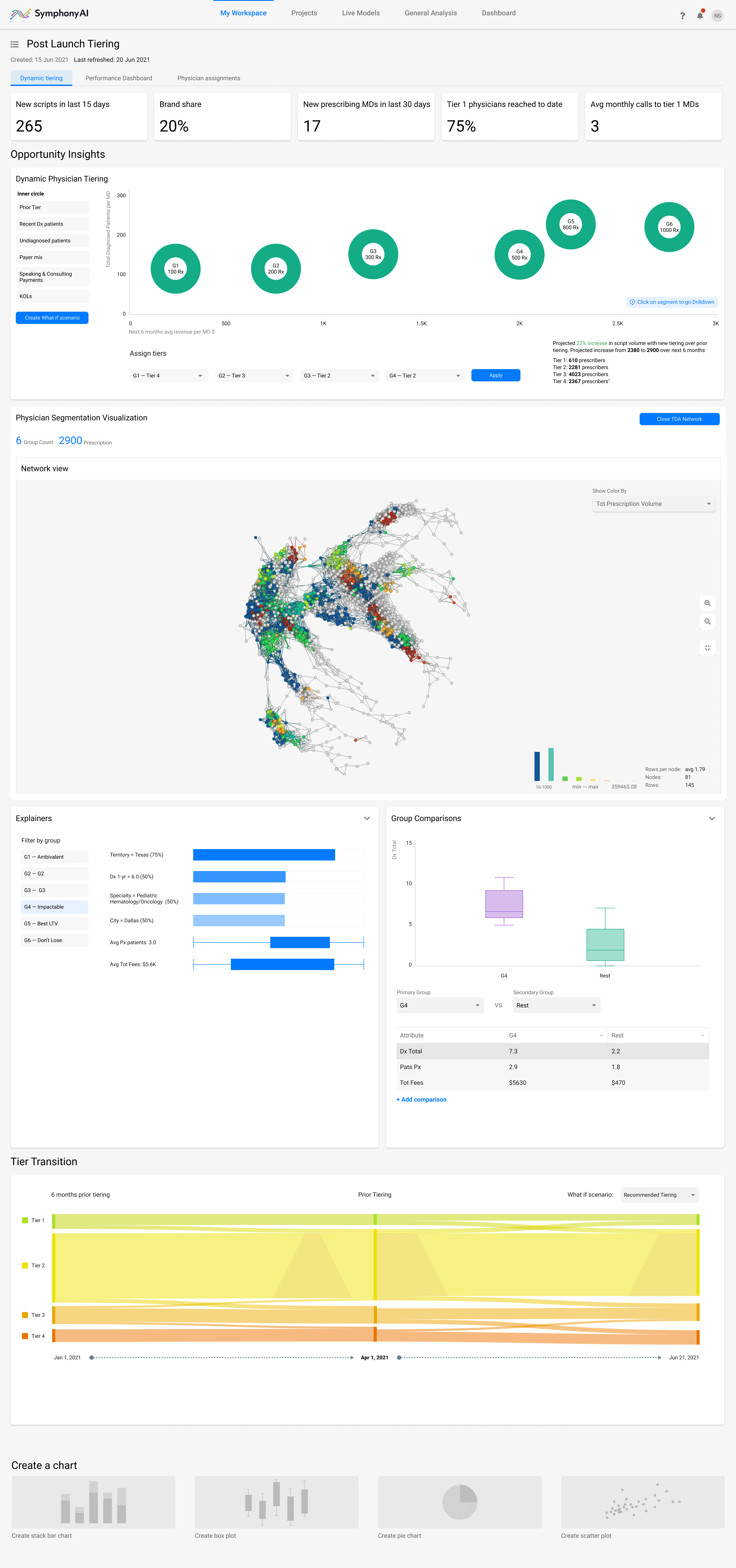
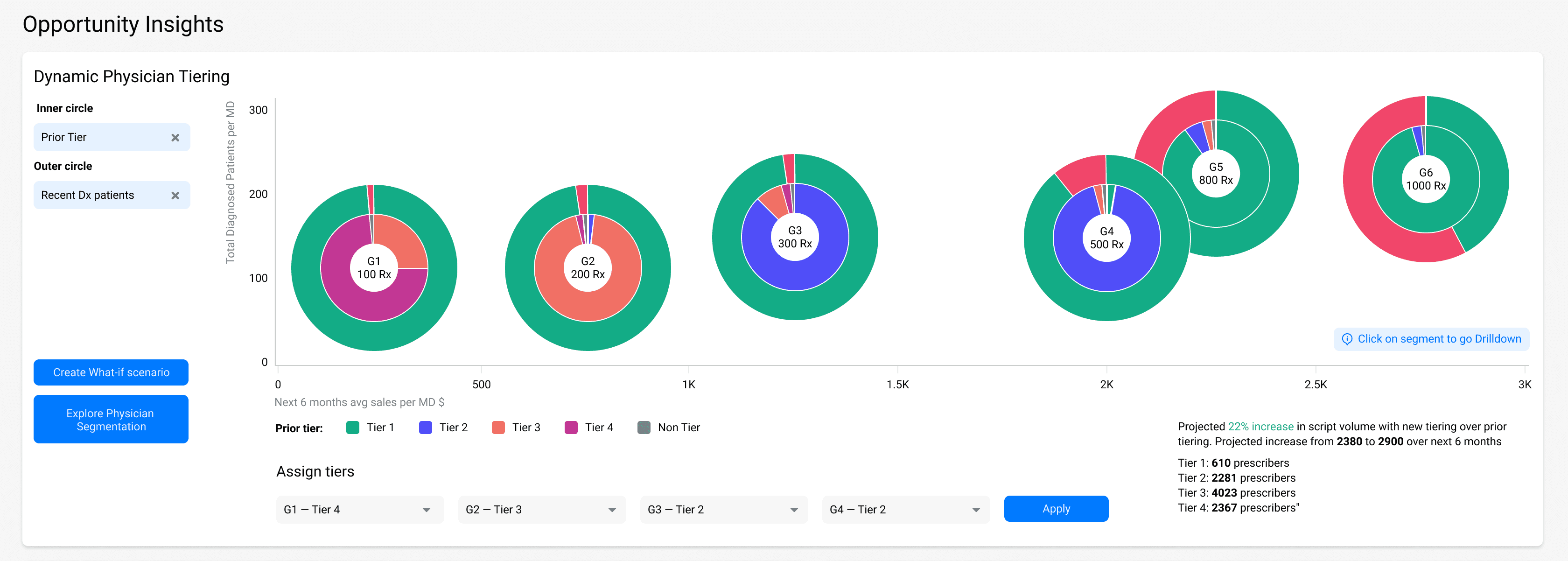
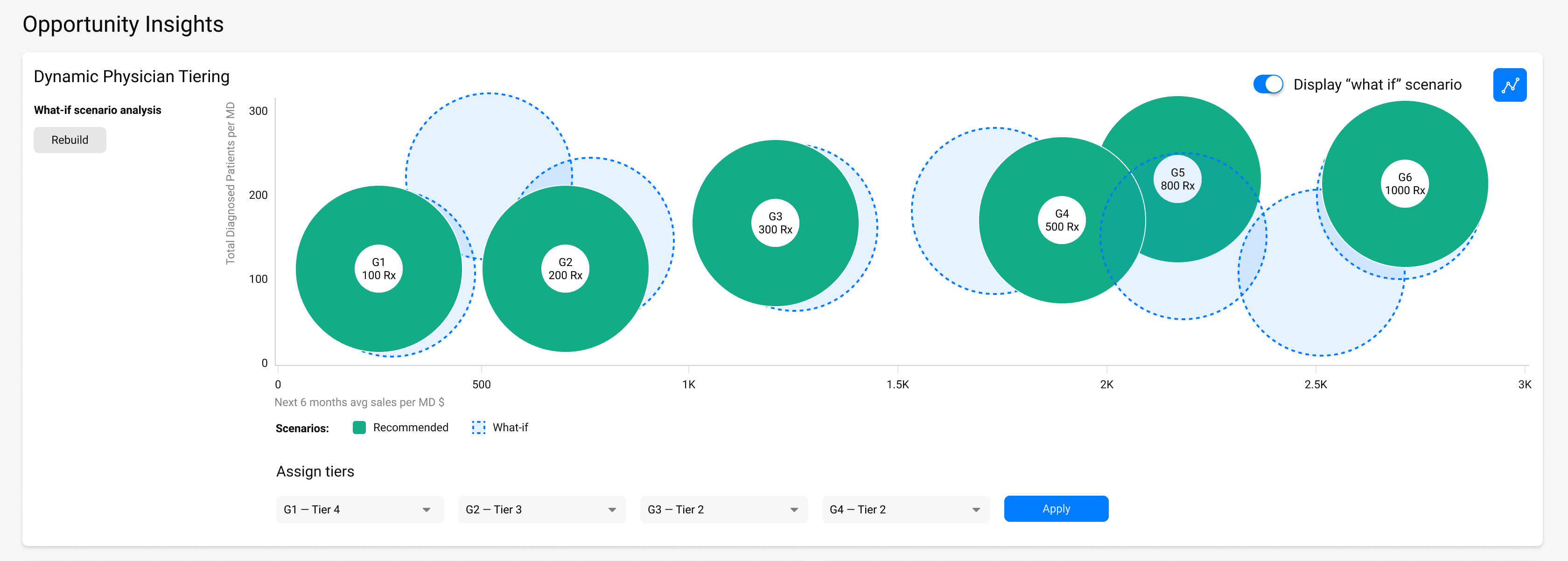
Dynamic Tiering Tab
Dynamic Tiering Tab
Dynamic Tiering module visualized how Symphony AI’s model automatically re-classified physicians after launch, based on prescribing behavior and network influence. The dashboard combined KPIs, dynamic segmentation, and network visualization to help sales and marketing teams identify high-impact targets and simulate re-tiering scenarios.
Dynamic Tiering module visualized how Symphony AI’s model automatically re-classified physicians after launch, based on prescribing behavior and network influence. The dashboard combined KPIs, dynamic segmentation, and network visualization to help sales and marketing teams identify high-impact targets and simulate re-tiering scenarios.
One of the most powerful and practical features is the “What If” Scenario.
It allows users to adjust input parameters and instantly see how these changes affect forecasts.
This provides a deeper perspective on key metrics and helps predict how performance might evolve over time.
One of the most powerful and practical features is the “What If” Scenario.
It allows users to adjust input parameters and instantly see how these changes affect forecasts.
This provides a deeper perspective on key metrics and helps predict how performance might evolve over time.
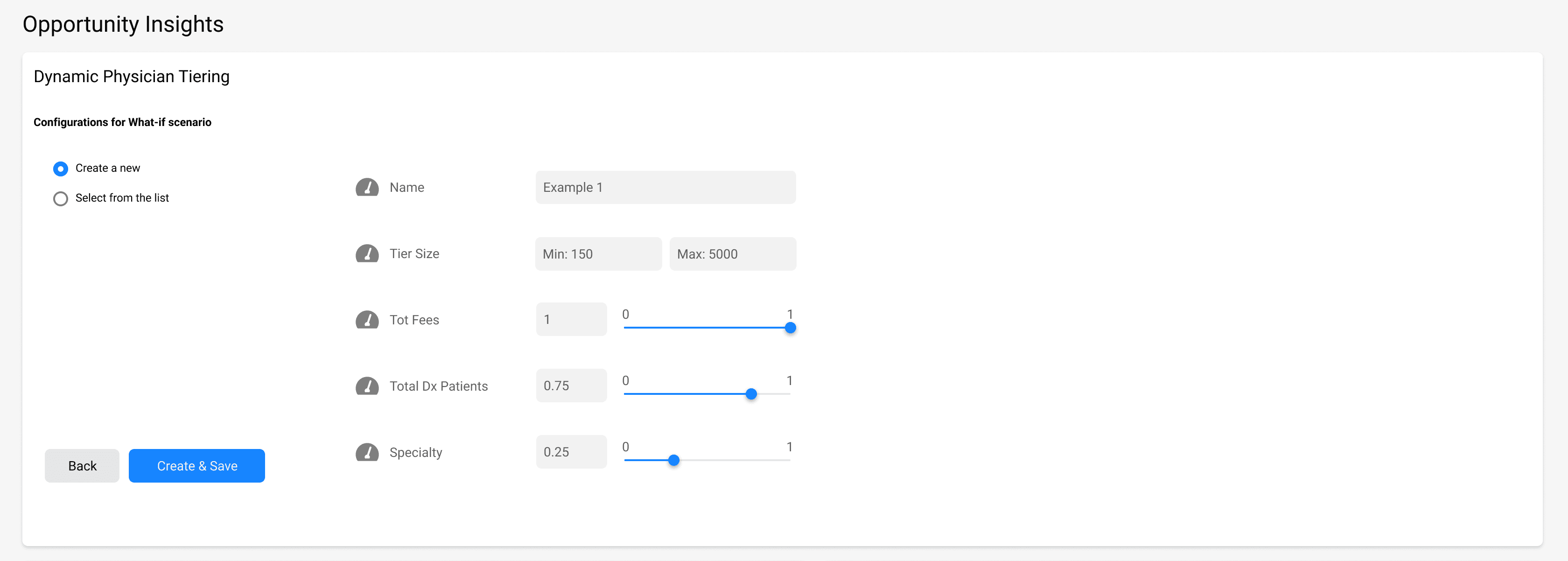
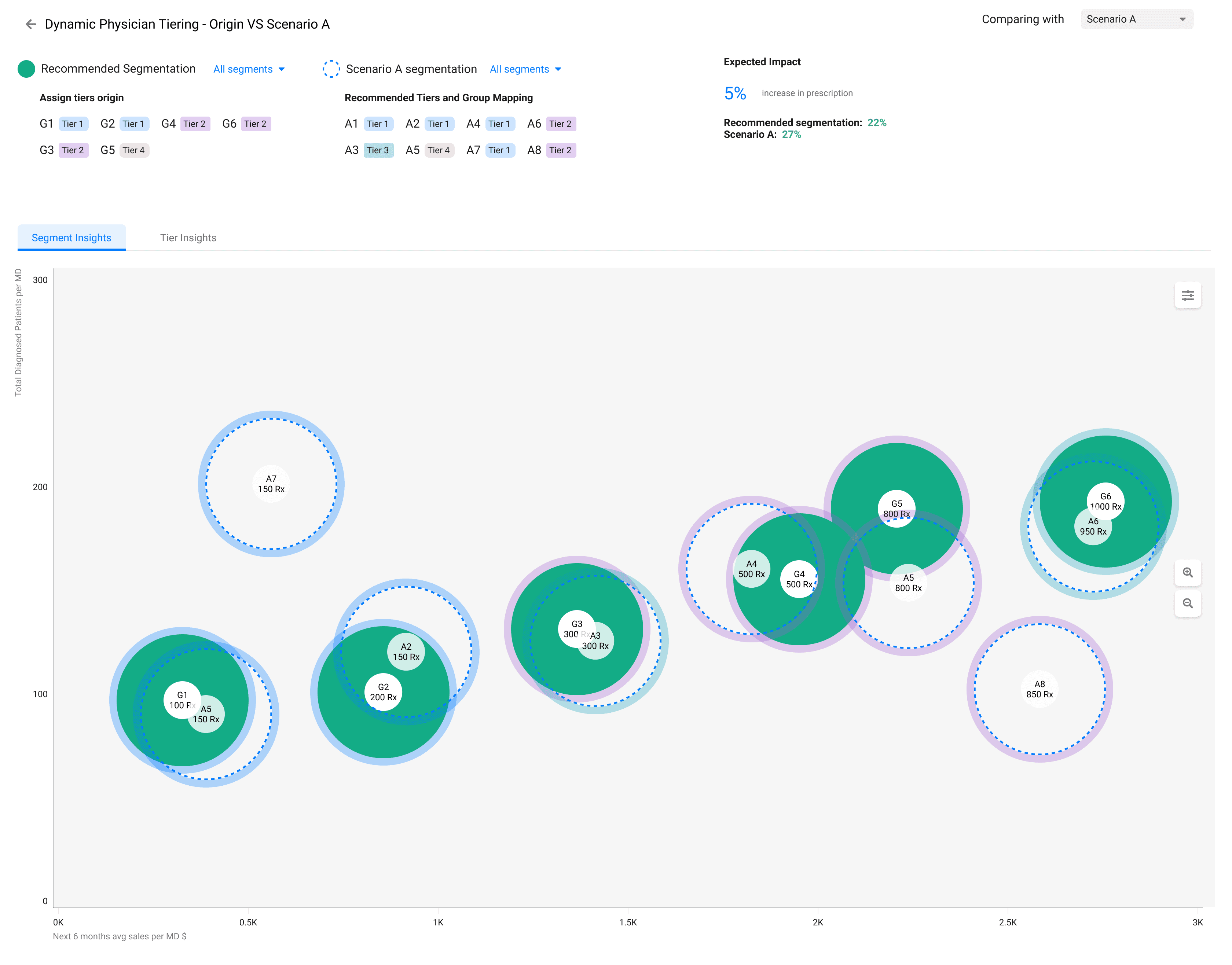
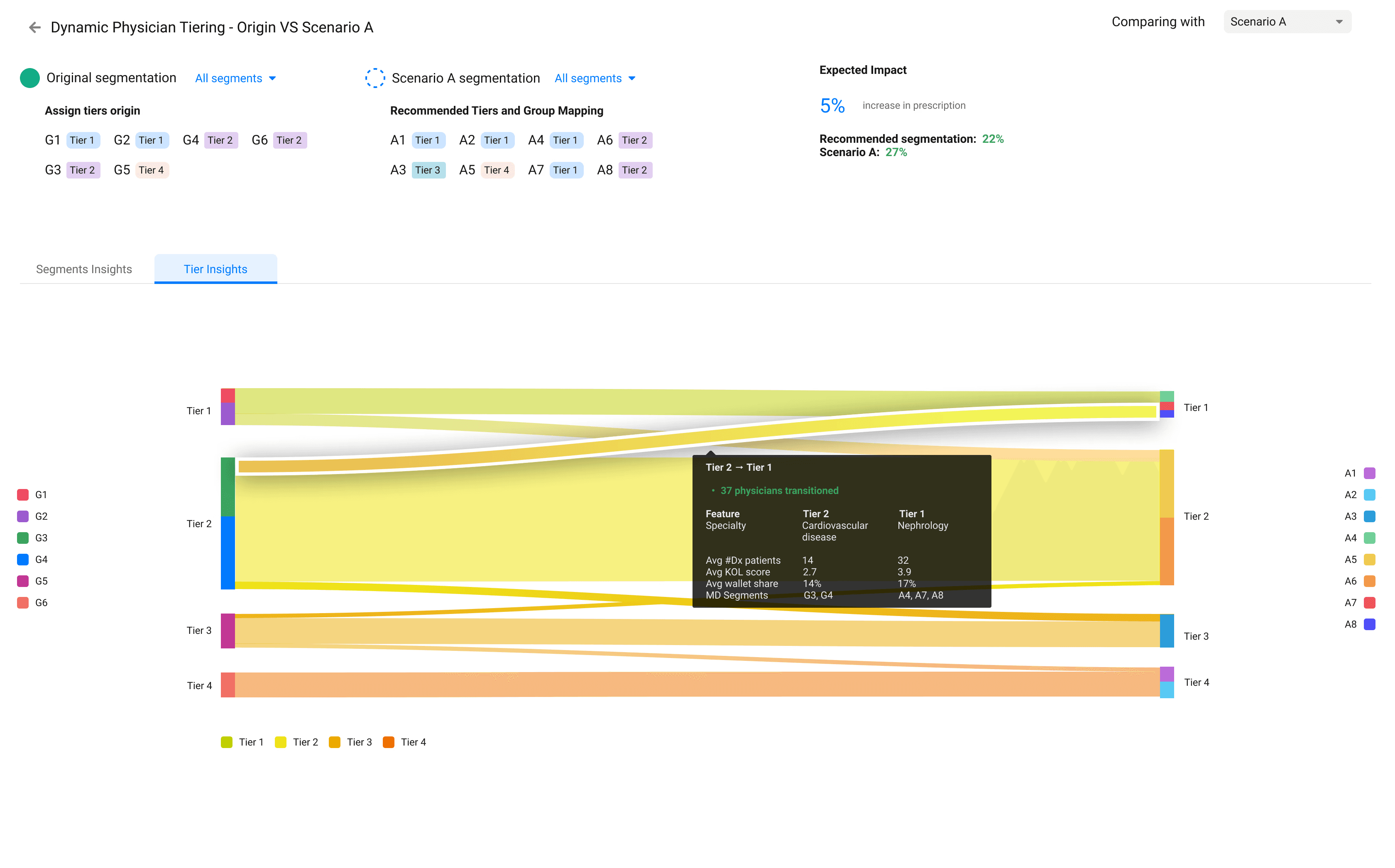
The What If Scenario can be expanded into a detailed view, where users can explore Tier breakdowns, Key Drivers, Expected Impact, as well as Segment Insights and Tier Insights presented through interactive charts.
This deeper view helps teams understand why certain projections change — not just how much. By visualizing the underlying factors, users can identify growth opportunities, validate assumptions, and make more confident strategic decisions based on data rather than intuition.
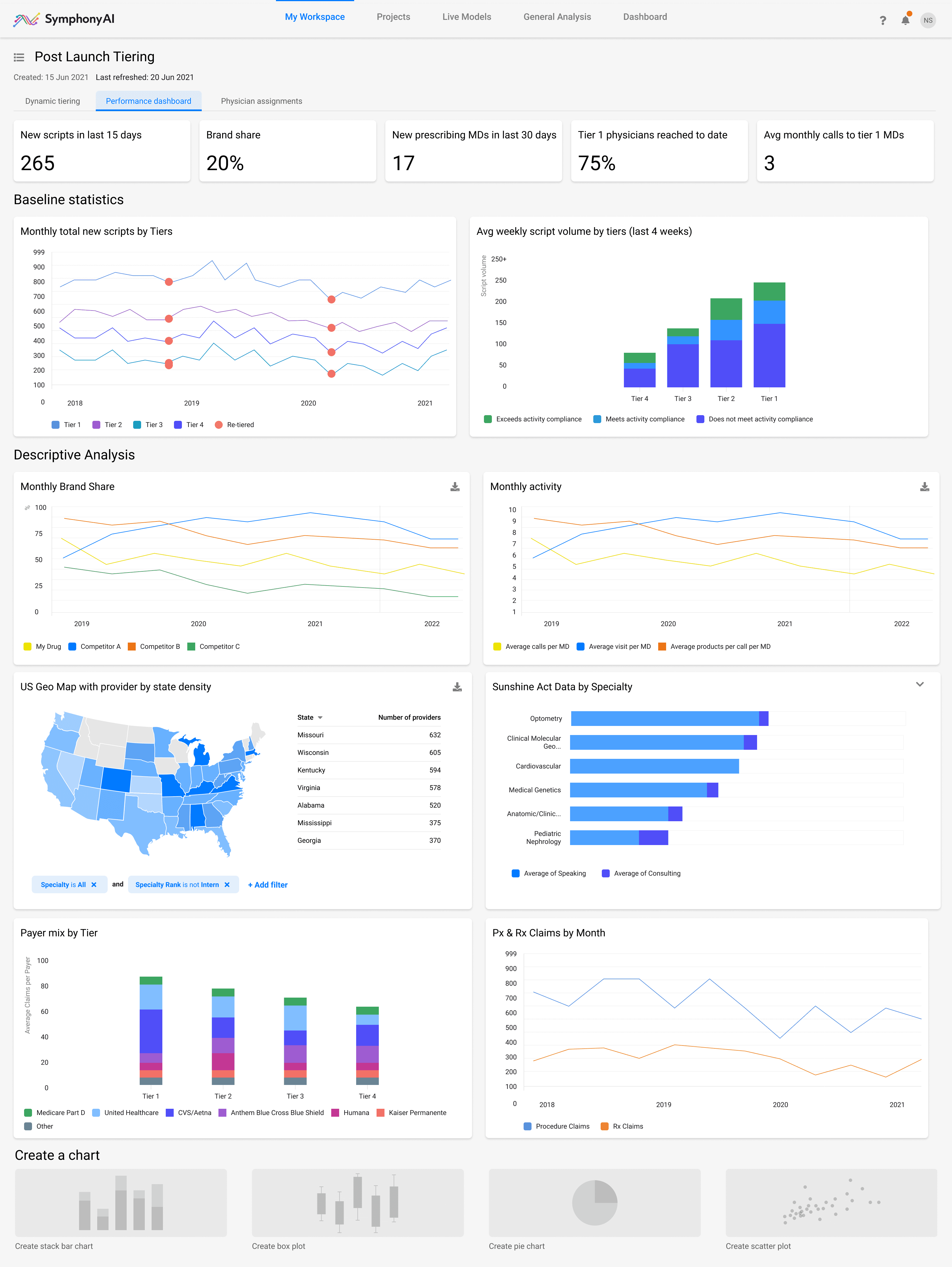
Performance Dashboard Tab
Performance Dashboard Tab
The Performance Dashboard consolidates post-launch metrics across tiers, specialties, and regions. It allows business and field teams to monitor prescription trends, track brand share, and correlate activity levels with real outcomes.
By combining baseline statistics, descriptive analysis, and payer insights, the dashboard provides a complete picture of market performance and helps identify where to focus next.
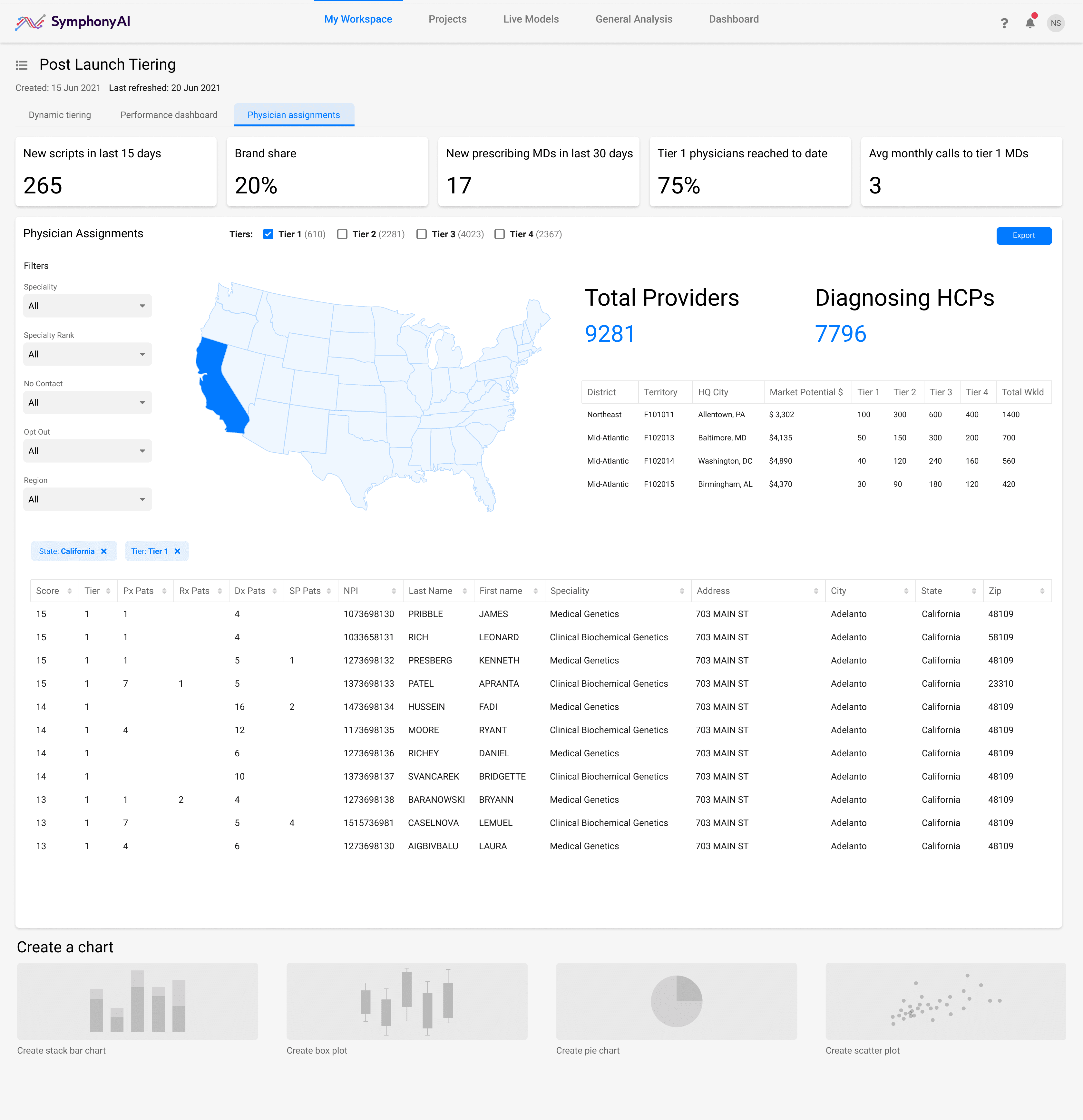
Physician Assignments Tab
Physician Assignments Tab
The Physician Assignments dashboard visualizes how healthcare providers are distributed across regions and tiers.
By combining an interactive geo-map, detailed provider tables, and regional potential metrics, users can plan outreach strategies and reallocate resources more effectively.
The view helps identify high-value physicians within specific territories, align field-team priorities, and monitor coverage progress in real time.
Outcome
Outcome
The prototypes achieved their primary goal — to demonstrate Symphony AI’s data-driven analytics in a clear, investor-ready format.
Both CLS and CDS systems turned abstract AI models into tangible product experiences, helping executives understand the potential of predictive insights across finance and healthcare.
The MVPs unified fragmented data, established a scalable design foundation, and set a consistent visual direction for future Symphony AI products.
Impact Highlight
Impact Highlight
$500,000
$500,000
in funding
in funding
A few months after completion, our marketing team presented both prototypes at an investor conference. The concept resonated — clear visuals, measurable outcomes, and a narrative investors could follow. As a result, Symphony AI continue full-scale development. What began as a proof of concept evolved into a launchpad for real growth.
A few months after completion, our marketing team presented both prototypes at an investor conference. The concept resonated — clear visuals, measurable outcomes, and a narrative investors could follow. As a result, Symphony AI continue full-scale development. What began as a proof of concept evolved into a launchpad for real growth.
Keep reading
Keep reading
More examples of design that drives results.
More examples of design that drives results.